Introduction
This start guide, together with Vue Reference, shows how to create a Vue application with a KeyLines chart.
For more details, see also the Vue.js Integration example.
Note that if you store KeyLines in your source control you must ensure it's not publicly available. Read more about the Obfuscation Requirements before deploying your application.
Step 1: Create and serve a Vue app
If you already have an existing project up and running, you can skip this step and continue adding KeyLines from Step 2, replacing my-vue-app with the name of your project's root directory and integrating the example code into your application code.
If you don't have an existing project, you can create one with Vite by following the Vite Getting Started guide for your preferred package manager.
Alternatively, run this quick start command to create a Vue Vite app and start the development server in one step:
npm create vite@latest my-vue-app -- --template vueyarn create vite my-vue-app --template vuepnpm create vite my-vue-app --template vueIf you are prompted about any settings while the command is running, you can accept the default values.
Once the process has finished, the terminal will show the development server URL where the boilerplate app is running.
By default, Vite runs a dev server at http://localhost:5173. You can start it any time from the my-vue-app directory:
npm run devyarn devpnpm run devStep 2: Add KeyLines to the app
Download the KeyLines package from the link below and move it to the my-vue-app directory.
Download KeyLinesIn the terminal from my-vue-app, add KeyLines as a package dependency:
npm install file:./your_downloaded_file_name.tgzyarn add ./your_downloaded_file_name.tgzpnpm install file:./your_downloaded_file_name.tgzNext, you need to copy the files that contain Vue wrappers for KeyLines components into your Vue application.
Run the following command from inside the my-vue-app directory to copy the files to the correct location:
cp -R ./node_modules/keylines/vue/ ./src/componentsStep 3: Create a chart
Now let's set up a Vue component to create a chart. We will do this in the src/App.vue file.
The App.vue is a Single-File Component (SFC), which means that it can contain code for a template, logic, and styling of a Vue component all together:
- Inside the
<template>tag - The UI markup in HTML - Inside the
<script setup>tag - The component's logic in JavaScript - Inside the
<style>tag - The component's styles in CSS
First, replace the existing <template> tag.
The new tag specifies:
- the id of the KeyLines component's parent HTML element,
- the containerClass with the CSS class of the component's container
div, - the data object loaded into the component,
- the kl-ready event which receives the
klReadyfunction with a reference to the chart and will be fired when the component is ready:
<template>
  <kl-chart id='kl' containerClass='klchart' :data='data' @kl-ready='klReady'/>
</template>
Then update the existing <script setup> tag with one that imports the KeyLines chart component and adds a simple KeyLines chart:
<script setup>
  import KlChart from './components/Chart.vue';     // import the KeyLines chart component
  import { ref } from 'vue';

  const chart = ref(null);     // a reference to the KeyLines chart component

  function klReady(loadedChart) {          // A function called when the KeyLines component is ready to use
    chart.value = loadedChart;
  }

  const data = {
    type: 'LinkChart',     // A KeyLines Chart type - must be 'LinkChart'
    items: [{
      id: 'node1',
      type: 'node',
      t: 'Hello World',    // node text label
      c: '#43976C'         // node colour
    }],
  };
</script>
And finally, add a <style> tag to set the dimensions for the KeyLines chart:
<style>
  #app {
    height: 100vh;
    width: 100vw;
    box-sizing: border-box;
    margin: 0;
    display: block;
    padding: 0;
    max-width: none;
  }

  *, *:before, *:after {
    box-sizing: inherit;
  }

  body {
    margin: 0;
  }

  .klchart {
    width: 100%;
    height: 100%;
  }
</style>
Once the chart component is created, the chart data property containing a node with a green colour (c property) and a text label (t property) is loaded and laid out with the default layout.
Then, the kl-ready event is fired which calls the klReady function with a reference to the chart. Finally, the klReady function saves the chart reference.
The default layout is the organic layout, which is a versatile force-directed layout algorithm that is especially great for large datasets and complex networks, but there are also other layouts you can explore.
When you reload the page, there should be no errors in your developer console or in your application and you should see a simple KeyLines chart in your browser:
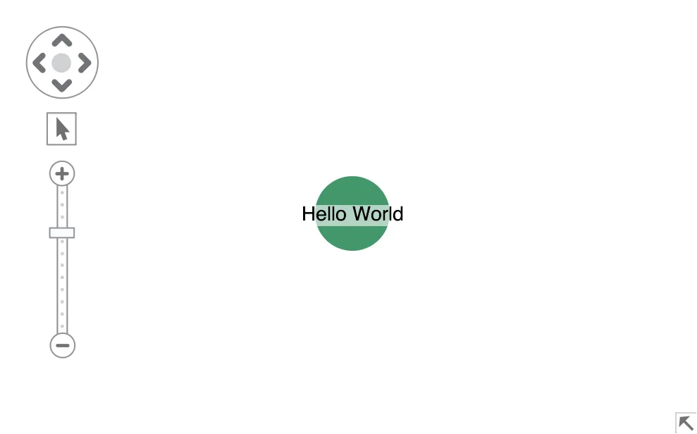
Charts have a range of native options such as navigation to pan and zoom or overview window icon at the bottom right corner to toggle a chart overview.
Step 4: Add and parse the data
Inside the <script setup> tag, add a rawData object just below the import statement:
const rawData = {
  person: [
    { name: "Jenny", teamId: 1 },
    { name: "Rosie", teamId: 0 },
    { name: "Peter", teamId: 0 },
    { name: "Sam", teamId: 1 },
  ],
  messages: [
    { from: "Jenny", to: "Sam", amount: 17 },
    { from: "Sam", to: "Jenny", amount: 12 },
    { from: "Sam", to: "Peter", amount: 1 },
    { from: "Rosie", to: "Jenny", amount: 2 },
    { from: "Peter", to: "Rosie", amount: 7 },
  ],
};
This dataset details messages between two teams of people.
KeyLines accepts a ChartData object, which defines an array of chart items and their attributes. This means that we will need to parse our raw data to a KeyLines chart object. This is how we've defined our data model:
- People are represented by nodes. Nodes require a
type: 'node'and a uniqueid. The default node colour is transparent, so we will also set thecproperty. - Messages between people are represented as links. Links require a
type: 'link', a uniqueid, andid1andid2properties whose values are ids of nodes at each link end.
To parse the data, add this function right below the new rawData object:
function parseData(data) {
  const items = [];

  data.person.forEach(({ name }) => {
    // defines people as nodes
    items.push({
      id: name,
      type: "node",
      c: "#43976C",
    });
  });

  data.messages.forEach(({ from, to }) => {
    // defines messages as links
    items.push({
      type: "link",
      id: `link_${from}_${to}`,
      id1: from,
      id2: to,
    });
  });

  return { type: "LinkChart", items }; // adds 'LinkChart' required by KeyLines
}
Still inside the <script setup> tag, locate the data variable and replace the value with a call to the parseData function:
const data = parseData(rawData);When you reload the page, your application and developer console should be clear of any errors and you should see this network in the browser:
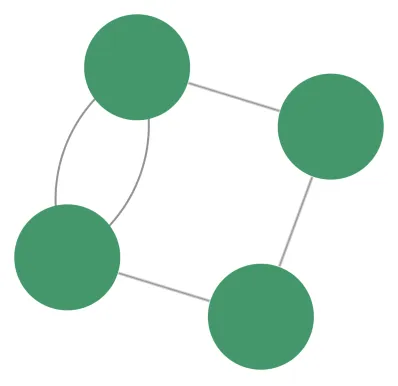
Our data model is now visualised as nodes and links, but it's difficult to distinguish the individual items on the chart. To address this, we will incorporate details as styling in the next step.
Step 5: Add details with styling
KeyLines offers a variety of styling options for nodes and links. In our chart, we will use node and link styling as a way of showing item metadata.
To style the nodes, we will:
- Use the c property to set a different colour for each team
- Use the t property to add a text label and style it
To do this, update the first part of the parseData function where we have defined the people as nodes:
data.person.forEach(({ name, teamId }) => {
  items.push({
    id: name,
    type: "node",
    c: ["#43976C", "#ff6f61"][teamId], // node colour by team
    t: { fbc: "transparent", fs: "auto", fc: "white", t: name }, // white backgroundless text sized to fit the node
  });
});
To style the links, we will:
- Use the w property to scale the link widths based on the number of messages sent
- Use the a2 property to set a direction arrow that identifies the direction of the communication
To do this, update the second part of the parseData function where we have defined the messages as links:
data.messages.forEach(({ from, to, amount }) => {
  items.push({
    type: "link",
    id1: from,
    id2: to,
    id: `link_${from}_${to}`,
    a2: true, // arrow pointing to the recipient
    w: Math.pow(amount, 0.8), // link width scalable by amount to the power of 0.8
  });
});
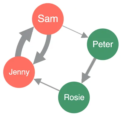
A reloaded chart now reveals which individuals belong to a specific group (team) and the strength of the relationship between the individuals (the amount of communication).
Step 6: Customise the chart options
Now let's customise some chart options. The chart options APIs can be used to change styling, display and interaction defaults of the chart as an element that integrates into your application.
Inside the <script setup> tag, add the following chartOptions object:
const chartOptions = {
  selectedNode: { ha0: { c: "#f5bd1f", r: 37, w: 8 } }, // creates a halo around selected node
  controlTheme: "dark", // turns navigation controls and overview window to dark mode
  backColour: "#1b2327", // a background colour
};
And then update the <template> tag to include the options object that will override the default component options with your new options:
<template>
  <kl-chart id='kl' containerClass='klchart' :data='data' :options='chartOptions' @kl-ready='klReady'/>
</template>
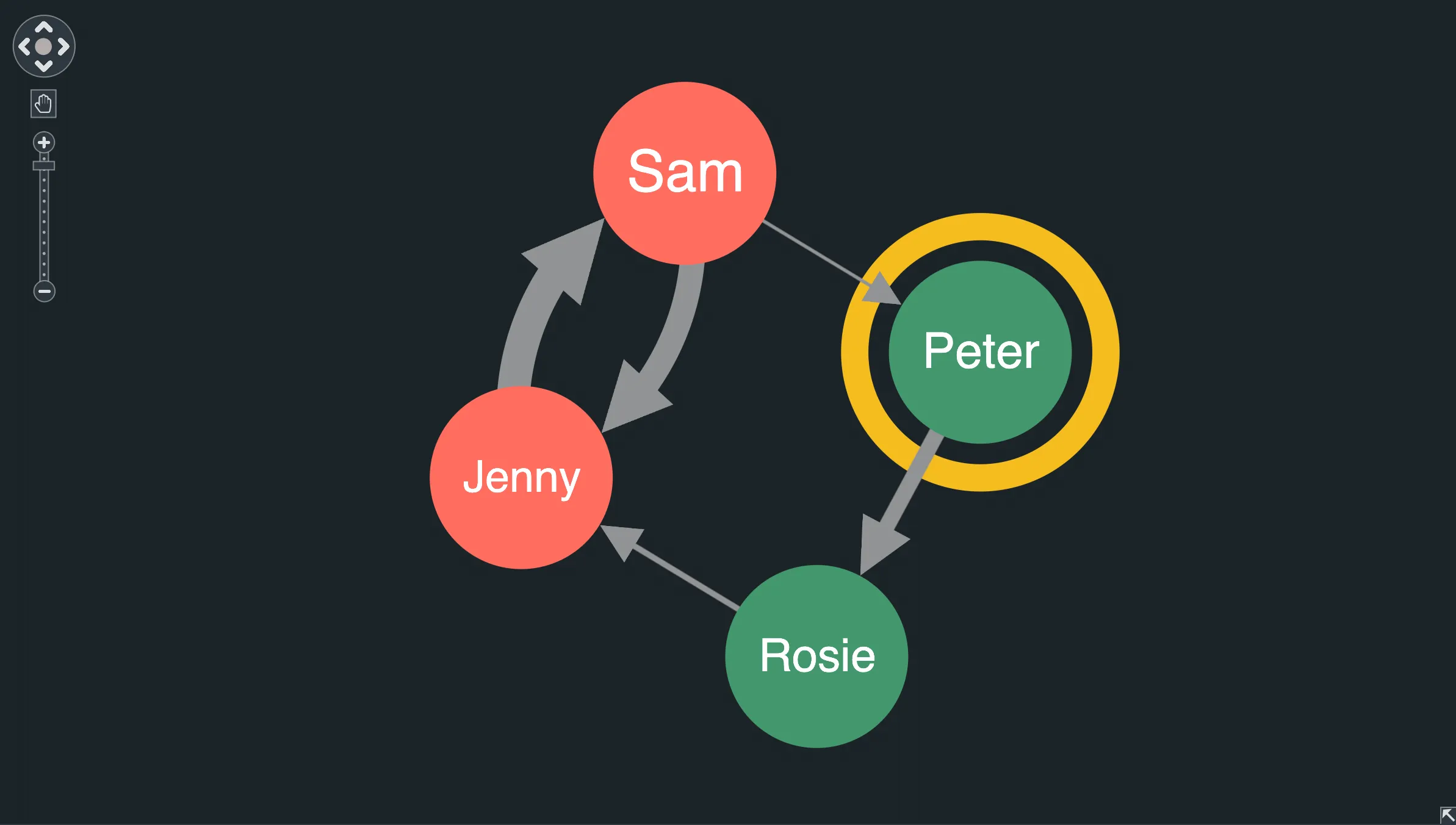
After page reload, the resulting chart looks like this when the 'Peter' node is selected:
Step 7: Add event handling
In this step, let's add some code to respond when the user clicks an item on the chart.
KeyLines lets you respond to virtually any user event on the chart using chart events.
Add a click handler after the klReady function:
function clickHandler({ id }) {
  console.log(`you clicked on ${id}`);
}
And then update the <template> tag to bind the kl-click event to the clickHandler function:
<template>
  <kl-chart id='kl' containerClass='klchart' :data='data' :options='chartOptions' @kl-ready='klReady' @kl-click='clickHandler'/>
</template>
Reload the page and try clicking chart items, navigation controls or the chart background. In the developer tools console you'll see that a string containing the id of the clicked item or navigation control is passed to the click handler, or null if you click on the chart background.
Step 8: Add foregrounding on selection
Now let's set a foregrounding behaviour that highlights the user-selected item and its immediate neighbours, which is particularly helpful for large charts with densely connected nodes. Add a selectionHandler function responding to a kl-selection-change event after the clickHandler:
function selectionHandler() {
  const itemIds = chart.value.selection();
  const selectedItems = chart.value.getItem(itemIds); // Ensure we have clicked on a link or node, not the navigation control
  if (selectedItems.length) {
    const neighbours = chart.value.graph().neighbours(itemIds); // Foreground the selected item and its neighbours
    chart.value.foreground(
      (item) => itemIds.includes(item.id) || neighbours.nodes.includes(item.id),
    );
  } else {
    // Clicked on background - restore all items to the foreground
    chart.value.foreground(() => true);
  }
}
And then update the <template> tag to bind the kl-selection-change event to the selectionHandler function:
<template>
  <kl-chart id='kl' containerClass='klchart' :data='data' :options='chartOptions' @kl-ready='klReady' @kl-click='clickHandler' @kl-selection-change='selectionHandler'/>
</template>
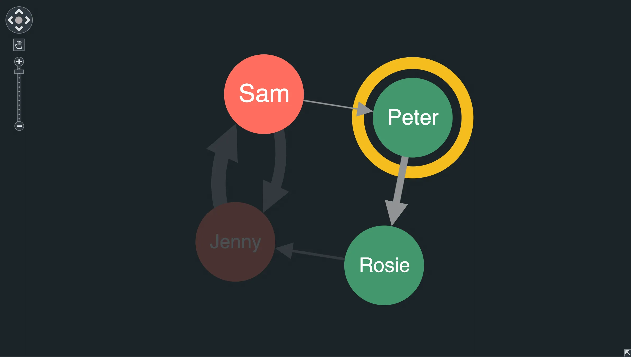
Reload the page and click items in the chart.
The selectionHandler function uses chart.getItem to check whether the clicked id belongs to a node or a link in the chart. If it does, then we use chart.graph().neighbours() to find the nodes connected to the clicked item, and then call chart.foreground() to put them in the foreground, and other chart items in the background.
If the user clicked on something else, such as the chart background, then we foreground all the chart items.
Next steps
This is just the beginning of what KeyLines can offer.
You can continue reading about the features from this tutorial in Chart Basics, Layout Basics and Events Basics.
Have a look also at our Demos and our API Reference, or visit our blog for interesting articles about graph visualisation.
Here's a few suggestions on where to go next if you're interested in...
- More information about KeyLines and Vue? Try the Vue Integration demo and the Vue Reference documentation.
- Adding font icons to items in your chart? Head to Fonts and Font Icons for help.
- Grouping nodes or links to summarise your chart? Take a look at Combos and Aggregate Links.
- Filtering chart by time or learning about changes over time? Read about the KeyLines Time Bar component.
- Running graph analysis or social network analysis? Read about Graph Engine and Graph Centrality.