Nodes with similar properties can be grouped into combos. Combos make busy charts easier to analyze, or reveal patterns which would otherwise be difficult to see.
To create a combo, specify which property on the data object should be used to group your nodes in the properties array of the combine prop.
For example, if your nodes have a data.city property, you can group them like this:

Combos Simple
Log in to view live examplesSometimes, combining by a single property isn't enough to get the data model we want. For example, San Jose may refer to a city in two different countries - in the USA or in Mexico. To address this, we can define a hierarchy for grouping items.
We can add a data.country property and pass 'city' and 'country' into properties. ReGraph now recognizes that San Jose, USA is different to San Jose, Mexico, and combines nodes correctly. This is similar to the 'group by' clause in a database query.
The level value of 1 currently shows a single combo level, but you can also set it to enable Nesting.
Combos Props
Log in to view live examplesWhen a combo is created, the onCombineNodes event is triggered. The event also fires in these scenarios when the combo is updated:
- The combine prop is set to a new object.
- The data properties specified in the properties array change on any node in the chart.
- A node with data properties used in the properties array is added or removed from the chart.
- A node change inside the combo triggers a combo resize. These changes include node resizing, node shape changes or label changes.
You can use the onCombineNodes event for combo Styling.
See the Basic Combos story for an example how to create combos.
Nesting
Using the level property in the combine prop, you can set the number of levels of nested combos to display in your chart. To create a nested grouping, pass the property names into properties from the most specific to the least specific field (for example city, country, continent), and set the level to 3 to include all levels:
Combos Nested
Log in to view live examplesIf you have multiple distinct and unrelated hierarchies in your data, ReGraph can automatically group them separately.
Pass the names of all grouping properties into properties and set the level to the total number of grouping properties in the array, and ReGraph will automatically create separate nested combos for related hierarchies.
Combos Nested 2
Log in to view live examplesStyling
When combos are created, the onCombineNodes and onCombineLinks events are fired. You can style the combos or summary links by calling the setStyle functions in the handlers of the respective events. The setStyle function accepts a single parameter which is an object containing information relevant to the combo or summary link.
const combineNodesHandler = ({ setStyle }) => {
  setStyle({
    open: true,
    color: '#fedd03',
    label: { text: 'Open combo', fontSize: 30 },
    closedStyle: {
      color: '#17BA99',
      label: { text: 'Closed combo', fontSize: 30 },
    },
  });
};

const combineLinksHandler = ({ setStyle }) => {
  setStyle({
    lineStyle: 'dashed',
    width: 5,
  });
};

return (
  <Chart
    // ...
    onCombineNodes={combineNodesHandler}
    onCombineLinks={combineLinksHandler}
    // ...
  />
Summary links can be styled just like regular links and support all the Link properties. See the Summary link setStyle section for details.
Combos can have different styling in open and closed state.
Closed combos can be styled just like regular nodes and support all the Node properties. Their styling is done in the closedStyle object inside the Combo setStyle function.
Open combos are styled directly using the combo setStyle API. See the Open combo styling section for details and available properties.
Open and closed combos
The open property passed to the combo setStyle function controls if the combo is open or closed. You can leverage this to add extra interaction to your chart. For example, you might load all combos closed, and then open them if the user double clicks on it. Here is a basic example of (static) closed combos:
Combos Closed
Log in to view live examplesSee the Open and Close Combos story for an example.
Open combo shape
Open combos come in two possible shapes - 'circle' or 'rectangle'. You can set this in the shape property of the combine prop. Circular combos use 'lens' as the default arrangement, while rectangular combos use 'grid'.
Rectangular combos are particularly useful when using the sequential layout. See the Combo Tightness story for an example of using combos in sequential.
Open combo styling
Open combos support border, fade and label Node properties and color and glyphs Item properties. See the Combo setStyle API for the full list of available properties. Nodes inside open combos can also be arranged in different ways, as described in Layouts Inside Combos.
An open combo label can be styled using any of the properties available for Node Label. This feature is currently in beta. Just like for nodes, you can also pass an array of objects to add multiple labels:
Open Combo Labels
Log in to view live examplesThere are simple concepts that describe the positioning rules between labels in open combos and combo contents, that is nodes or child combos:
Label above or below the content:
|  |
Label to the left or right of the content:
|  |
Multiple inline labels to the left or right of the content
|  |
Label behind the content
|  |
Labels on both sides of the content
|  |
See the Styling Combos and Combo Tightness stories for examples of open combo styling.
Summary Links
The options.combo.autoSelectionStyle property controls default behavior on selecting nodes and links, when there are combos on the chart. When a node or link that is within a combo, or connected to a combo, is selected, it and its neighbors, including the contents of summary links, are brought to the foreground. If you wish to create custom behavior, you can do so by setting autoSelectionStyle to false, and using the contents and summary properties returned in a handler for onCombineLinks. Here is an example of switching between showing all contents, and showing only the summary links using onCombineLinks:
Combos Links
Log in to view live examplesArrangements in Combos
When placing nodes inside open combos, ReGraph uses arrangements instead of layouts to make the best use of space. You can also use the tightness option to specify how closely items are spaced together.
You can pass the arrangement name directly to arrange, or pass in an object to also set additional options:
<Chart onCombineNodes={
  (comboDefinition) => {
    const { nodes, combo, id, setStyle } = comboDefinition;
    setStyle({
      arrange: {
        name: 'sequential',
        orientation: 'right',
        linkShape: 'curved',
        tightness: 7
      }
    });
  }
}/>LensAs with the lens layout, this arrangement pushes highly-connected nodes into the center, and forces less connected nodes into the periphery. The lens arrangement gives a space-efficient view of networks inside combos. | 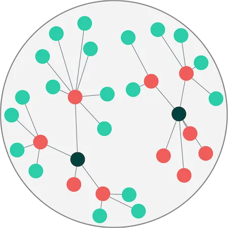 |
GridGrid arrangement lays out nodes in rows and columns. You can control the number of rows or columns with the gridShape option. The grid arrangement provides the best use of space when using rectangular combos. See the Grid Arrange story. | 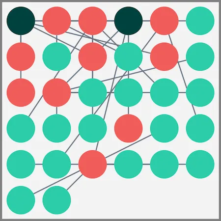 |
ConcentricConcentric arrangement lays out nodes in a series of rings, with larger nodes in the center. The concentric arrangement provides the best use of space within combos when the links within the combo are not important. | 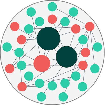 |
SequentialJust like the sequential layout, this arrangement lays out a hierarchy of nodes according to which levels they belong to, and in a way that minimizes empty space and link crossings. You can further customize this arrangement in the arrange object. See the Sequential Arrange story. | 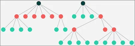 |