Styling Basics
Chart items such as nodes, links and annotations support a wide variety of customization options to make them suit your application. To do this, set properties on the item definitions in the items prop.
When you select a node or a link (default by clicking), it is styled with a selection style. This style is set using the selection chart option.

ReGraph Example
Log in to view live examplesExplore various styles in the Node Gallery, Link Gallery and Advanced Annotation Gallery examples.
Sub-items
As well as customizing chart items, you can also specify various sub-items.
Sub-items are either decorations on chart items (such as labels or glyphs), or parts of chart items themselves (such as an annotation container). Sub-items can respond to events. The following sub-items can also have their own style rules:
- Halos - rings around nodes. The default node selection style uses halos. Each node support up to ten halos at any one time.
- Glyphs - decorations on nodes annotations, combos, or links. On nodes, annotations and combos, glyphs are placed around the border. On links, glyphs are placed next to the label at the link center or at link ends.
- Donuts - segmented borders around nodes which can indicate trends or relationships within that node, similar to a pie chart.
- Labels - additional information, such as text, font icons or images, to display with nodes, annotations or links.
The following example shows sub-items in action:
ReGraph Example
Log in to view live examplesFor more details and a full list of sub-item types, see the Sub-item section in the API Reference.
Interaction styling
Interaction styling applies when the user hovers over or selects an item or a sub-item. Once the pointer moves away or the the item is deselected, the styling reverts back to the values defined in the items prop.
You can also set selected items by passing their ids to the selection chart prop. Removing items from the prop deselects them and removes the selection styling.
There are two ways to set interaction styling - using the onItemInteraction event or the selection chart option.
The onItemInteraction event
The onItemInteraction event applies when specified items or sub-items are hovered or selected. It is best for adding more complex styling to a smaller number of items.
ReGraph Example
Log in to view live examplesAll items and sub-items in the event's item and subItem properties can be styled. Note that annotations and their sub-items ('container' and 'connection') are not selectable and can only be styled for hover interactions.
To apply interaction styling, pass the new styling to the event's setStyle function:
const interactionHandler = ({ selected, id, itemType, setStyle }) => {
  let newStyle = { };
  if ( selected && itemType === 'node' ) {
    newStyle = {
      ...newStyle,
      label: [{ text: 'selected' }],
    };
  }
  setStyle({ [id]: newStyle });
};

return (
    <Chart
      / ... /
      onItemInteraction={interactionHandler}
    />
);
If an item is styled by both the selection chart option and the onItemInteraction event, the selection option takes precedence. Set the option to false to override this.
See also the Interaction Styling example to learn more onItemInteraction.
Chart-wide selection
The properties available in the selection option are set for the whole chart. These properties apply to nodes, combos (open and closed), links (including summary and content links) and labels (including node, link and combo labels).
The color property applies a selection halo to a node, a background color to a label and a selection marker in the middle of a link. The labelColor property applies a font color to a label.
In these special cases related to node labels, properties are ignored:
color:
- When the label is defined as an array of objects and the
backgroundColoris set - When the label is defined as an object and both
backgroundColorandpositionare set
labelColor:
- When the label is defined as an array of objects and the
coloris set - When the label is defined as an object and both
colorandpositionare set
In these cases, use onItemInteraction instead.
Node Styling
There are various reasons why your charts may need a custom node design:
- A high level of information (e.g. several pieces of information shown by single node)
- Dynamically changing data (e.g. strings or numbers in varying length)
- Different types of data (e.g. visual or numeric information, relative amounts)
- The specific design language of your application
ReGraph supports different customization levels from simple to more advanced node styles.
Below are some examples of the ReGraph API for node styling:
shape: Setswidthandheightto get rectangular nodes.radius: Sets corner radius to nodeborder.label: Accepts an array of one or more objects to create multiple labels with a large number of customizable properties such asimage,position,border,margin,paddingortextAlignment. This feature is currently in beta. See the Node Label API for details.imageAlignment: controls scale and position of images and font icons inside nodes.
For more examples, see also the Node Gallery and Advanced Node Gallery stories.
ReGraph Example
Log in to view live examplesLabel positioning
Labels are anchored to nodes from the outside or from the inside.
The position property accepts a string compass value to set the label outside the node, or an object with vertical and/or horizontal properties to set the label inside the node.
Set the position of images and font icons within node labels using position and margin. You can also control the scale of font icons using fontSize.
ReGraph Example
Log in to view live examplesMultiple inline labels
By default, multiple labels on a node are stacked vertically from the top. There are two ways how to position multiple labels on the same line using the vertical option of position:
- set it to 'inherit' if the preceding label label has no
verticalposition set - set it to the same value if the preceding label has a
verticalposition set
ReGraph Example
Log in to view live examplesLabel sizing and label content
A label can either contain an image or text-based information such as text or a font icon.
Image labels have image set, and can be sized by specifying both maxWidth and maxHeight. You can also specify border and position them using margin and position, but other label settings are ignored.
Labels containing text or a font icon are sized, by default, to fit the content that's inside. In this case the ReGraph API lets you modify the label size and also customize the content inside:
minWidth,minHeight: Set custom label size.textAlignment: Sets the alignment of content inside a labelfontSize:'auto': Scales the font to any label size and zoom level.textWrap:'normal': Wraps the content on whitespace.maxWidth,maxHeight: Controls maximum size when text wrapping or automatic font sizing are used.
ReGraph Example
Log in to view live examplesLabel margin and padding
You can set margin and padding to fine-tune label spacing and position:
- Specify
marginby setting the distance between the label edge and either another label edge, or its parent node edge. This API behaves like, and can be set similarly to, W3C CSS margin. - For non-image labels, set the
paddingproperty which is specified, and behaves like, W3C CSS padding. This doesn't apply to image labels because the image always fills the label.
Link Styling
There are various reasons why your charts may need a custom link design:
- To visualize direction, movement or volume of data
- To carry additional pieces of information
- To highlight different aspects of data
- To follow the specific design language of your application
Below are some examples of the ReGraph API for node styling:
arrowandglyphs: Can be set separately for each link endcolor: Can be set to same or different values for each end, creating a gradientflow: Sets a dashed animation on the linklabels: Sets a label in the middle of the linklineStyleandwidth: Sets a style and width of the linklinkShape: Sets the shape of link path
You can style the whole link, or style its individual ends using the end1 and end2 properties.
Explore various styles in the Link Gallery story.
Link Shapes
Link shape refers to the shape of a link path, and helps highlight particular aspects of your data structure for different chart layouts and combo arrangements. Direct links are used by default, but you can change that at chart level using the layout linkShape option. You can then fine-tune the appearance of your chart by specifying a different link shape at combo level using the arrangement linkShape option. See Using a mixture of link shapes for information about how to use multiple link shapes.
Link shape summary:
direct | The default. Direct links are straight lines that run directly between nodes. Well-suited to charts that concentrate on overall connectivity using organic, lens or radial layouts. | 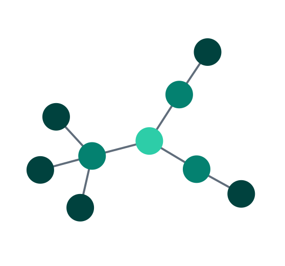 |
| Angled links provide an orthogonally branching shape between nodes in a hierarchical structure, aligned with layout orientation. Especially suited to sequential layouts. In beta from v5.1. Use priority links to highlight different paths, as shown in the Angled Links example. | 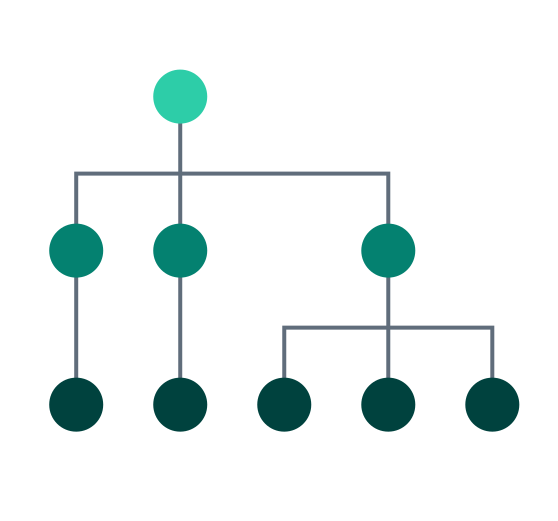 |
curved | Curved links follow a smooth path between nodes in different levels of a hierarchical structure, aligned with layout orientation. Useful for hierarchical data, especially sequential layouts. | 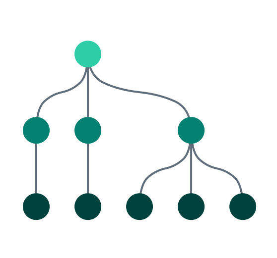 |
Leaflet Integration always uses direct links.
Using a mixture of link shapes
In addition to using an overall link shape for your chart layout, with perhaps another for combo arrangements, you can also specify the link shape for an individual link, which takes precedence.
Setting an individual link's linkShape property, specifies its shape, and the direction in which it connects to its end nodes. This can be useful to represent different types of relationship in your chart.
For example, you might have a chart with a sequential component using angled links, and want to show the relationship between that, and another set of nodes, using curved links, as shown.
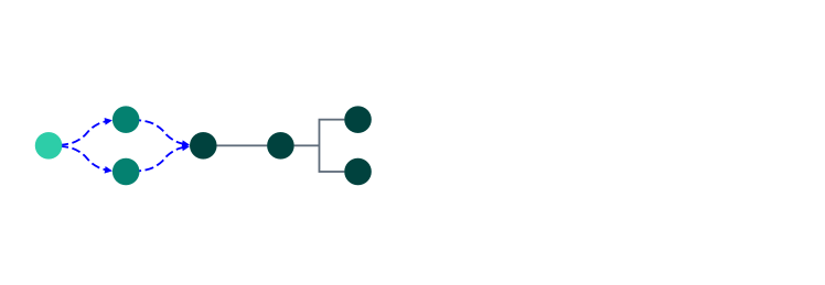
Learn more in the Mixed Link Shapes example.
Multiple links between two nodes
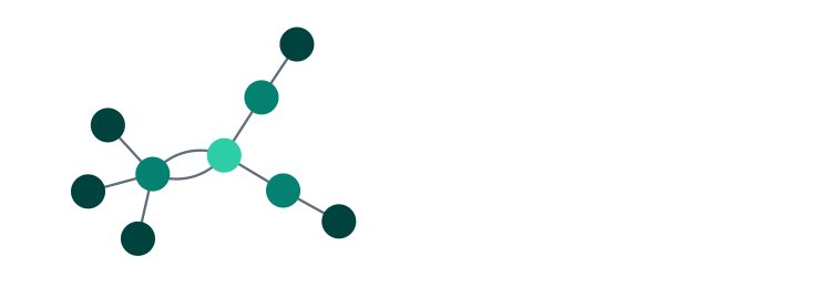
By default ReGraph automatically spaces out multiple direct or curved links (as described in Link Shapes) running between two nodes by separating their midpoints. Direct links are separated to follow arcs, as shown, while curved links follow double curves.
Angled links can't helpfully be separated this way, so to focus on a critical path through a chart using angled links, use priority links.
Priority Links
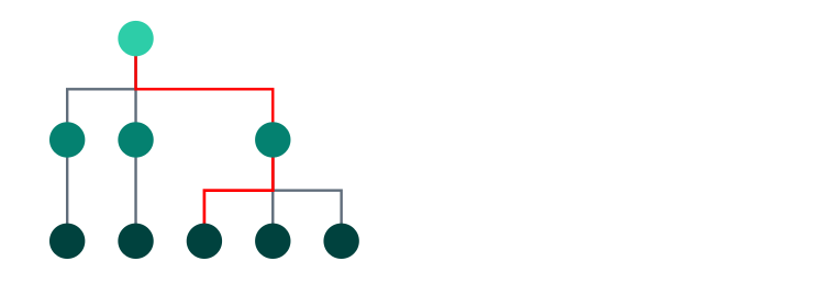
To help focus on a particular path through a dense and overlapping network of nodes and links, you can assign priority to particular links to show them clearly, and in front of other links. This can be useful when using angled links, as illustrated, which can overlap each other.
Explore the use of link priority, used to highlight the attack path in the Cloud Security showcase.
Fonts
Fonts define the look of characters including letters, numbers and symbols. Many font families offer multiple font variants with different font weights or styles.
ReGraph lets you use custom fonts for text inside glyphs and labels, and it renders these custom fonts consistently across the chart.
If not set, ReGraph uses 'sans-serif' as the default font family.
See the Advanced Node Gallery with Raleway, Montserrat and Valera Round fonts.
Adding fonts
ReGraph lets you use fonts from a variety of sources including:
- Using content delivery network (CDN) link
- Using a package manager to download a package
- Hosting downloaded files (eg. CSS or
.woffor.ttffiles)
For any source, we recommend using document.fonts from the CSS Font Loading API to ensure fonts are fully loaded before rendering. This approach is also used below.
First, add the font to your HTML file in your project's root folder. We're using the Google Raleway font and a CDN link from Google Fonts to generate a script for two different font weights, 400 and 800:
For the "Hello World" app, add the script in my-regraph-app/index.html:
<!-- index.html -->

<!-- weights 400 and 800 -->
<link rel="stylesheet" type="text/css"
href="https://fonts.googleapis.com/css2?family=Raleway:wght@400;800&display=swap" />
To use multiple font weights or styles of the same font, you must update your application's CSS with a unique @font-face declaration for each variant. If you are only using a single font weight or style, no CSS changes are needed.
If you are using a CDN link, click the link generated in the script to find the @font-face rules.
For the "Hello World" app, you can add the CSS code in my-regraph-app/src/App.css:
/* src/App.css */

@font-face {
  font-family: 'Raleway';
  font-style: normal;
  font-weight: 400;
  font-display: swap;
  src: url('https://fonts.gstatic.com/s/raleway/v28/1Ptug8zYS_SKggPNyCMIT5lu.woff2') format('woff2');
}

@font-face {
  font-family: 'Raleway Bold';  /* create a unique name for this font weight */
  font-style: normal;
  font-weight: 800;
  font-display: swap;
  src: url('https://fonts.gstatic.com/s/raleway/v28/1Ptug8zYS_SKggPNyCMIT4ttDfA.woff2') format('woff2');
}
Import the React library in the file where your ReGraph component is declared. For the "Hello World" app, this is in my-regraph-app/src/App.jsx:
// src/App.jsx

import React from "react"; // will be needed later
Next, set the default fontFamily in chart options. This font is used inside labels and glyphs unless a font family is explicitly set on the label/glyph in the fontFamily property.
// src/App.jsx

<Chart
  // ...
  options={{ labels: { fontFamily: "Raleway" } }}
/>;
Next, define and load the fonts and start the app once the fonts have loaded. Add the following code after the App() function:
// src/App.jsx

// lazy-loads the chart after the font is available
const FontReadyChart = React.lazy(() =>
  Promise.all([
    document.fonts.load("24px 'Raleway'"),
    document.fonts.load("24px 'Raleway Bold'"), // defined in CSS in step 2
  ]).then(() => ({
    default: App,
  })),
);

// main component (Demo) renders ReGraph chart
// rendering suspended until fonts are ready
function Demo() {
  return (
    <React.Suspense fallback="Loading fonts...">
      <FontReadyChart />
    </React.Suspense>
  );
}

export default Demo; // replaces export default App; previously in your code
The fonts are now loaded and we can use them in our chart. Update the items prop:
// src/App.jsx

<Chart
  items={{
    node1: { label: { text: "Hello World!" } },
    node2: { label: { text: "Hello Bold!", fontFamily: "Raleway Bold" } },
  }}
  options={{ labels: { fontFamily: "Raleway" } }}
/>;
At the end of this step, you should see a custom font with two different weights in your app.
Right-to-Left Text
ReGraph supports multiple languages, including right-to-left (RTL) and bidirectional (BIDI) writing systems such as Arabic and Hebrew.
When RTL characters are detected, ReGraph applies RTL auto support by default. This is a reliable approach for a large scope of cases including:
- Mixed-system texts with both LTR and RTL characters
- Texts containing punctuation, numbers, emojis or other special characters
- Strings with symbols in strict functional order such as e-mail addresses or URLs
See the Right to Left Text example to see RTL auto support in action.
If you wish to always reverse the order of the whole text, or if you have specific requirements for more complex cases, you can use forced RTL mode:
<Chart dir="rtl" />;You can also use control characters in the label text to embed a specific direction.
For more details on using control characters, see How to use Unicode controls for bidi text (W3C documentation). Note that this page references isolated control characters, which ReGraph doesn't support.
Font Icons
Font icons are vector-based glyphs embedded in font files, where specific character codes are mapped to icons instead of traditional letters or numbers. They are highly customizable as you can scale their size and dynamically change their color.
ReGraph lets you use font icons as node icons, glyph icons (on nodes, links, annotations and combos) and label icons (inside node and annotation labels).
See the Font Awesome, Material Icons and IcoMoon examples with different font icon libraries.
Adding font icons
- If you don't have a ReGraph project, follow the steps in Create New ReGraph App to create a quick app with a single "Hello World" node.
- This guide assumes that you are using ReGraph 5.4 or newer. To use it with older versions, see Troubleshooting.
To use font icons in ReGraph, you can load them from a variety of sources including:
- Using content delivery network (CDN) link
- Using a package manager to download a package
- Hosting downloaded files (eg. CSS or
.woffor.ttffiles)
For any source, we recommend using document.fonts from the CSS Font Loading API to ensure font icons are fully loaded before rendering. This approach is also used below.
First, open a new terminal in your project's root folder and install the latest version of your icons using your preferred package manager. We're using Font Awesome Free Icons.
npm install --save @fortawesome/fontawesome-freeyarn add @fortawesome/fontawesome-freepnpm install --save @fortawesome/fontawesome-freeIn the file where your ReGraph component is declared, import the font icon families and the React library. For the "Hello World" app, this is in my-regraph-app/src/App.jsx:
// src/App.jsx

import "@fortawesome/fontawesome-free/css/all.css"; // both solid and regular style
import React from "react"; // will be needed later
Next, set the default iconFontFamily in chart options. This is used unless a font family is explicitly set on the item/subitem in the fontFamily property.
// src/App.jsx

<Chart
  // ...
  options={{ iconFontFamily: "Font Awesome 6 Free" }}
/>;
Next, define and load the fonts and start the app once the fonts have loaded. Add the following code after the App() function:
// src/App.jsx

// lazy-loads the chart after the font is available
const FontReadyChart = React.lazy(() =>
  Promise.all([
    // include both as we imported all.css in step 2
    document.fonts.load('900 16px "Font Awesome 6 Free"'), // fas (solid, weight 900)
    document.fonts.load('400 16px "Font Awesome 6 Free"'), // far (regular, weight 400)
  ]).then(() => ({
    default: App,
  })),
);

// main component (Demo) renders ReGraph chart
// rendering suspended until fonts are ready
function Demo() {
  return (
    <React.Suspense fallback="Loading fonts...">
      <FontReadyChart />
    </React.Suspense>
  );
}

export default Demo; // replaces export default App; previously in your code
The font icons are now loaded and we can use them in our chart. Update the items prop in the App() function:
// src/App.jsx

  items={{
    node1: { label: { text: "Hello World!" } },
    node2: {
      label: [
        { fontIcon: { text: 'far fa-handshake' } },
        {
          fontIcon: { text: 'fas fa-globe', color: '#2B65EC' },
          position: { vertical: 'inherit' },
        },
    ]},
  }}
At the end of this step, you should see two nodes in your application - one with a text label and another one with font icons.
Font icon weights
Some font icons offer multiple font weights or styles as variants of the same font family.
For example, Font Awesome Free Icons are either Regular (far) or Solid (fas), which should be specified as part of the icon's CSS class name in the text property of fontIcon.
Others, such as Material Icons or Material Symbols, can include variants such as Filled, Outlined, Rounded or Sharp, where each variant must be imported separately and specified in the fontFamily property. The text property only requires the icon's ligature string.
To use a mix of weights or styles, declare a font family for each using @font-face in your CSS and give each a unique font-family name, for example:
/* Font weight of 300 */
@font-face {
  font-family: 'Material Symbols Sharp Thin'; /* a unique name in your CSS */
  font-style: normal;
  font-weight: 300;
  src: url(https://fonts.gstatic.com/s/materialsymbolssharp/v249/gNNBW2J8Roq16WD5tFNRaeLQk6-SHQ_R00k4c2_whPnoY9ruReaU4bHmz74m0ZkGH-VBYe1x0TV6x4yFH8F-H5OdzEL3sVTgJtfbYxPVojCLJ1H7-0Hk.woff2) format('woff2');
}

/* Font weight of 700 */
@font-face {
  font-family: 'Material Symbols Sharp Thick'; /* a unique name in your CSS */
  font-style: normal;
  font-weight: 700;
  src: url(https://fonts.gstatic.com/s/materialsymbolssharp/v249/gNNBW2J8Roq16WD5tFNRaeLQk6-SHQ_R00k4c2_whPnoY9ruReaU4bHmz74m0ZkGH-VBYe1x0TV6x4yFH8F-H5OdzEL3sVTgJtfbYxNspTCLJ1H7-0Hk.woff2) format('woff2');
}
See the Adding Fonts tutorial in the Fonts section for an example using @font-face rules.
The Material Icons example imports the variants as separate CDN links in the HTML tab.
Styling font icons
You can set a color as well as a custom fontFamily for the particular item's font icon inside the item's fontIcon property.
In addition, depending on the item where the font icon is used, ReGraph lets you customize its various properties:
- Node icons - Use
imageAlignmentto position the icon and scale the icon size. - Glyph icons (on nodes, links and annotations) - Use
imageAlignmentto position the icon and scale the icon size. - Label icons (on nodes and annotations) - Use the properties available for
node labelandannotation labelAPIs includingpositionorfontSize.
The example below uses Font Awesome Free Icons in Solid:
ReGraph Example
Log in to view live examplesTroubleshooting
Font icons showing as a single letter
If you complete the Adding font icons guide and the font icons are not displayed, you might be using an older version of ReGraph. In ReGraph 5.3 or older, Web Font Loader was used as an internal dependency to load font icons. Upgrade ReGraph to the latest version and review and repeat the tutorial steps to fix this issue. If you need help upgrading, see the Updating documentation or contact [email protected]. | 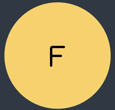 |
Font icons showing as plain text
If you complete the Adding font icons guide and the font icons are showing only as the plain text specified in the Review and repeat the steps in the tutorial and if the issue persists, contact [email protected]. | 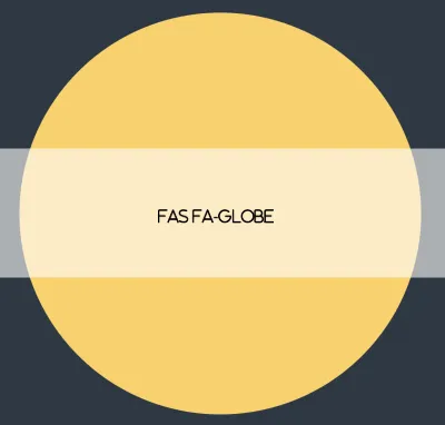 |
Font files loaded via CSS @import showing as a plain text
If you are importing font files using @import inside a CSS file, the validations in FontReadyChart can sometimes be executed before the CSS is processed. As a result, icons can fail to load and instead show as the plain text specified in the text option.
To fix this, include document.fonts.ready at the top of the chain of promises:
// lazy-loads the chart after the font is available
const FontReadyChart = React.lazy(() =>
  document.fonts.ready // resolves once the document has completed loading fonts
    .then(() =>
      Promise.all([
        // resolves when ALL the fonts are loaded
        document.fonts.load('1em "Material Icons"'),
        document.fonts.load('1em "Material Icons Outlined"'),
      ]),
    )
    .then((p) => ({
      default: App, // loads the component that includes ReGraph
    })),
);
Check the Material Icons demo for an example.
Material Icons / Material Symbols not showing
If your Google font icons are not showing, you may be using an older version of ReGraph or referencing them incorrectly. In ReGraph 5.3 or older, it was necessary to use the Unicode character of the icon, or to map the character to a class name using CSS, e.g.
.material-icons.person::before {
  content: '\e7fd';
}
And then to specify the icon:
fontIcon: {
  text: '\ue7fd',   // or 'material-icons person'
},
In ReGraph version 5.4 and newer, you can pass the ligature string of a Google fonts icon directly in the text property, such as text: 'person'.
We strongly recommend upgrading ReGraph to the latest version. If you want to continue using an older version, check that you are using the Unicode character as described.
Images
ReGraph lets you customize nodes, labels and glyphs with images using the image property, which accepts a string URL to any standard image type.
<Chart items={{
    node1: {
      image: '/images/person.png'
    }
    node2: {
      image: 'data:image/png;base64,<...>'
    }
  }}
/>
For best results, we recommend using images with a square aspect ratio for nodes (node image) and glyphs (glyph image). Images for labels can have any aspect ratio (label image).
ReGraph supports SVG images in all modern browsers. To further improve cross-browser compatibility, set width and height attributes in your SVG files.
To ensure performance and stability, SVGs are converted to bitmaps when they're drawn, and are restricted to a maximum of 256 x 256 pixels.
ReGraph can performantly display up to 900 distinct 256 x 256 images and font icons, limited only by the user's hardware. Using more than this is not recommended as it may affect chart rendering performance.
CORS Images
The Cross-Origin Resource Sharing (CORS) protocol imposes security restrictions that can affect images loaded from a different domain to your app. For example, you might run ReGraph from https://www.myapp.com/graph but fail to load images from https://s3.amazonaws.com.
ReGraph automatically tries to reload the failing images with the crossorigin HTML attribute set. You can import and use the setCorsAdapter config method to change the value of the attribute.
Any remaining missing or blocked images will appear as a blue X.
To safely display your cross-origin images, consider:
- If you control the image server, use
Access-Control-Allow-OriginHTTP headers to enable CORS requests. - Store the cross-origin images in URL-encoded strings.
- Provide an image proxy service on your app server. Instead of fetching images directly from their original source (that is, when your data includes an image prop with a value
http://s3.amazonaws.com/<image-name>), create an endpoint on your app server which forwards a request from the client. For example, if you create a proxy endpoint/imageproxy, the image url in your data would change to/imageproxy?target=http://s3.amazonaws.com/<image-name>. Your endpoint would extract the image URL from thetargetquery parameter, fetch the image data, and send it back to the client.
Using a CDN with an S3 Bucket
If you are serving images from an S3 bucket through a CDN, and ReGraph is still unable to download images:
- Ensure that your CDN cache is configured appropriately (according to your CDN docs).
- Ensure that you have also set the
VaryHTML response header, and that it includes the valuesOrigin,Access-Control-Request-HeadersandAccess-Control-Request-Method.
This ensures that the browser always tries to reload the images with the correct headers.