Introduction
Links represent connections between nodes within your data, and can be styled for visual impact, to convey meaning and to help highlight different aspects of your data structure.
Links can be customised for example with with arrows (using a1 and a2 properties for both ends), link colour (c), dashed or dotted line style (ls), or animation (flow).
You can use the d property to store custom data on links and display this data as glyphs and labels as shown in the Style Links demo:
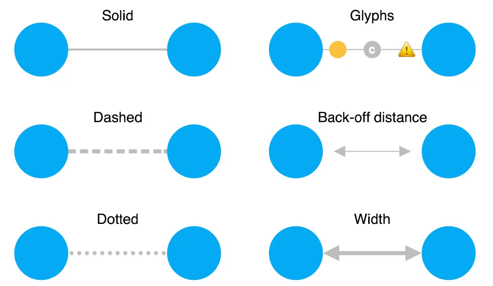
You can update link properties using setProperties, and control how links look and behave as users select them using the selectedLink chart option.
Links between nodes are direct straight lines by default, but some layouts and arrangements such as sequential can benefit from other link shapes.
Link shapes
A link shape is the path taken by a link connecting two nodes. KeyLines provides different link shapes to help enhance the clarity and impact of your dataset.
To change a link shape:
- For the chart: Use the
linkShapeoption for chart.layout() or chart.expand(). - Inside a combo: Use the
linkShapeoption for chart.combo().arrange() or in thearrangeoption of chart.combo().combine() or chart.combo().transfer().
See Using a mixture of link shapes for information about how to use multiple link shapes in your chart.
Direct links
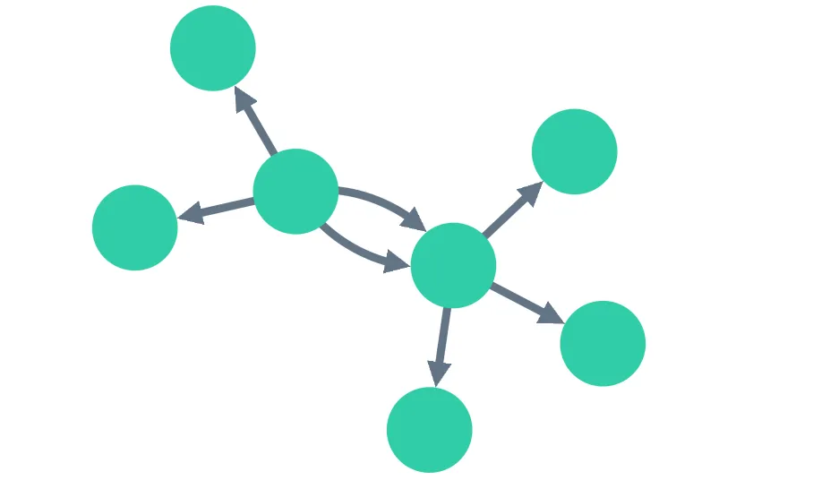
Direct links, the default option, are straight lines that run directly between two nodes. They are well-suited for charts focussing on overall connectivity, such as those using organic, lens, radial or structural layouts.
Multiple links between any pair of nodes are separated using arcs so that they don't overlay and obscure one another. If your chart contains large numbers of links between individual pairs of nodes or combos, you can bundle them into aggregate links.
Explore direct links and their properties in the Style Links demo.
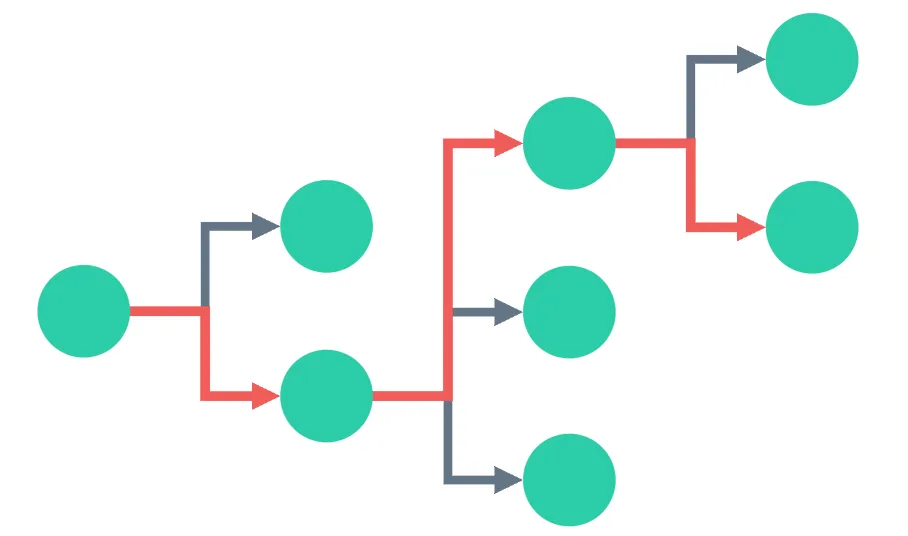
Angled links
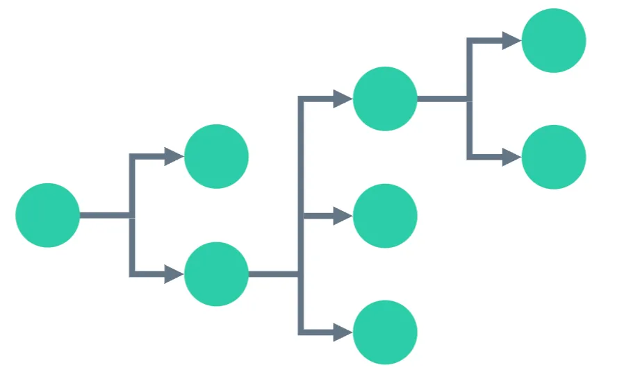
Angled links, currently in beta, provide an orthogonally branching shape. This shape is designed for hierarchical data using the sequential layout. Angled links are always aligned with the orientation of the layout. See Sequential Layout Options for details.
They are ideal for displaying charts with multiple levels of dependency. Pair them with the sequential combo arrangement to view and explore large, multi-layered data systems.
As angled links can often partly overlay one another, you can use priority links to surface and highlight particular paths.
Explore angled links and link priority in the Path Analysis in Trees demo.
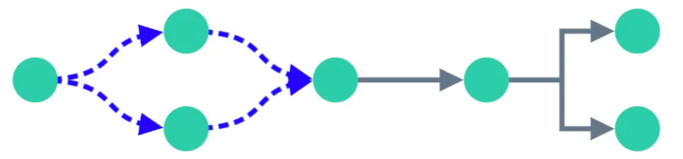
Curved links
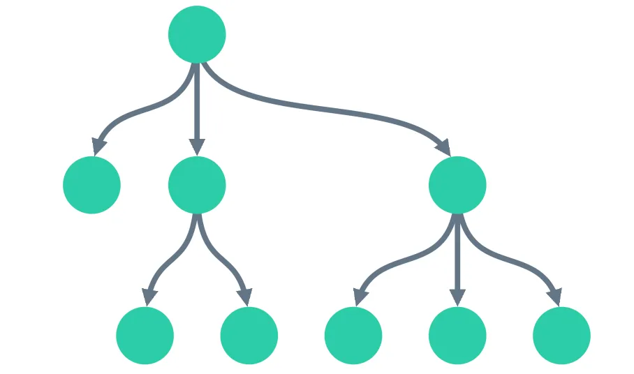
Curved links flow between nodes in different levels of a hierarchical structure. They are best suited to sequential layouts, and are aligned with the layout's orientation.
Multiple links between any pair of nodes are displayed with different curvatures so that they don't overlay and obscure each other.
Using a mixture of link shapes
Link shape can be set at different levels - at a chart level, at a combo arrangement level, or even for an individual link level (this option takes precendence).
Setting an individual link's linkShape property, currently in beta, specifies both its shape and the direction in which it connects to its end nodes. This can help represent different types of relationship in your chart.
For instance, you can have a chart with a sequential layout and angled links, where relationships between certain individual nodes are highlighted using curved links, as shown in our example.
Explore this further in the Mixed Link Shapes demo.
Prioritising links
If you have a busy chart or want to focus on a critical path through a network, KeyLines allows you to enhance the visibility of some links by designating them 'priority links', currently in beta.
To do this, set the priority link property. Priority links are displayed in a separate layer, in front of the non-priority layer, whether selected or not, and shown clearly at all zoom levels.
Explore the use of link priority in the Path Analysis in Trees demo.
Multiple links between two nodes
By default KeyLines automatically spaces out multiple direct or curved links running between two nodes to display them clearly. It does this by adding space, also referred to as an offset, between the midpoint of the links and the straight line joining their end-nodes.
Offset direct links follow arcs, as shown, while offset curved links follow a double curve.
Angled links are not offset. To focus on a critical path through a chart using angled links, use priority links.
You can also control how multiple links between a pair of nodes are displayed using link aggregation; see Aggregate Links
Self links
A self link loops from a single node back to the same node. Self links can visualise scenarios such as a direct loopback in an IT network, or an organisation sending payments to itself.
By default, self links are disabled and not loaded onto a chart. To enable them, set the selfLinks option to true. A self link is created when both id1 and id2 are set to the same node id.
chart.load({ type: 'LinkChart', items: [
  { type: 'node', id: 'node1', c: 'blue' },
  { type: 'link', id: 'selfLink1', id1: 'node1', id2: 'node1', a2: true }
]});
Self links are always drawn as arcs, no other link shape can be used. They cannot be dragged even when link dragging is set to true in the links property. You can use the off property to specify how far the link is offset from its default position.
See an example of a self link in the Style Links demo.
Self links and graph functions
Self links only affect the following graph functions:
- The components function includes self links in each component's links array.
- The neighbours function includes self links in its results.
By default, self links are disabled. If you are using the graph engine via KeyLines.getGraphEngine(), set the function's selfLinks option to true. If you are accessing graph functions via chart.graph(), enable self links in the chart selfLinks option.