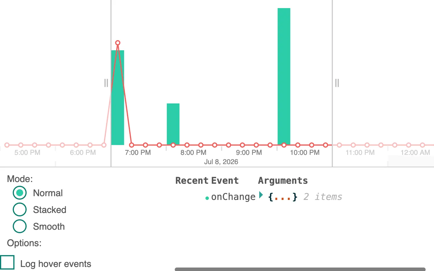
Interact with the time bar to see events logged in the controls below it.
You can control which events are logged with the checkboxes below the time bar, and switch between time bar modes to see the differences in the returned properties.
High-precision events (onPointerMove, onWheel) fire continuously, and will usually require throttling or debouncing if you cause state changes in their handlers.
ReGraph returns detailed information on each event.
See also
import React, { useMemo, useState } from "react";
import { createRoot } from "react-dom/client";

import mapValues from "lodash/mapValues";
import throttle from "lodash/throttle";
import ReactJson from "react-json-view";
import { TimeBar } from "regraph";

import data from "./data";
import { style } from "@ci/theme/rg/js/storyStyles";

import "@ci/theme/rg/css/layout.css";
import "@ci/theme/rg/css/button.css";

export const Demo = () => <TimeBarEvents items={data} selection={          } />;

const CheckBox = ({ id, text, onChange, checked }) => (
  <label htmlFor={id} className="container">
    {text}
    <input type="checkbox" id={id} defaultChecked={checked} onChange={onChange} />
    <span className="checkmark" />
  </label>
);

const createModeButton = (modeLabel, props) => {
  const { onModeChange, mode: currentMode } = props;
  const mode = modeLabel.toLowerCase();
  const id = `${mode}Mode`;
  return (
    <label key={mode} htmlFor={id} className="legend-radio">
      {modeLabel}
      <input
        type="radio"
        id={id}
        name="mode"
        defaultChecked={currentMode === mode}
        onChange={() => onModeChange(mode)}
      />
      <span />
    </label>
  );
};

const Options = (props) => {
  const {
    onClearLogs,
    logHoverEvents,
    onLogHoverClick,
    logPrecisionEvents,
    onLogPrecisionClick,
    expandArguments,
    onExpandArgumentsClick,
  } = props;
  return (
    <div className="event-options">
      <span className="mode-label">Mode:</span>
      {createModeButton("Normal", props)}
      {createModeButton("Stacked", props)}
      {createModeButton("Smooth", props)}
      <span className="mode-label">Options:</span>
      <CheckBox
        id="logOnChartHover"
        text="Log hover events"
        onChange={onLogHoverClick}
        checked={logHoverEvents}
      />
      <CheckBox
        id="logPrecisionEvents"
        text="Log high precision events"
        onChange={onLogPrecisionClick}
        checked={logPrecisionEvents}
      />
      <CheckBox
        id="expandArguments"
        text="Expand event arguments"
        onChange={onExpandArgumentsClick}
        checked={expandArguments}
      />
      <button type="button" onClick={onClearLogs}>
        Clear logs
      </button>
    </div>
  );
};

const EventNotificationCircle = (timestamp) => {
  const now = new Date().valueOf();
  const fadeDelay = 500;
  return (
    <div
      className={
        now - timestamp > fadeDelay
          ? "event-circle old-event-circle"
          : "event-circle new-event-circle"
      }
    />
  );
};

const EventLog = (props) => {
  const { history, expandArguments, ...rest } = props;

  return (
    <div className="logs" style={{ flexBasis: 0 }} {...rest}>
      <table className="events">
        <thead>
          <tr>
            <th className="right">Recent</th>
            <th>Event</th>
            <th>Arguments</th>
          </tr>
        </thead>

          {history.map(({ event, value, timestamp }) => (
            <tr key={timestamp}>
              <td>{                                  }</td>
              <td>{event}</td>
              <td>
                <ReactJson
                  src={value}
                  collapsed={expandArguments ? 2 : 0}
                  name={null}
                  enableClipboard={false}
                  displayDataTypes={false}
                />
              </td>
            </tr>
          ))}
        </tbody>
      </table>
    </div>
  );
};

function formatEvent(event) {
  if (event) {
    return mapValues(event, (propValue) => {
      if (typeof propValue === "function") {
        return "function";
      }
      return propValue;
    });
  }
  return event;
}

function TimeBarEvents(props) {
  const [history, setHistory] = useState([]);
  const [demoOptions, setDemoOptions] = useState({
    logOnHover: false,
    logPrecision: false,
    expandArguments: false,
    options: {
      style: {
        ...style.primary1,
        hoverColor: style.primary0.color,
      },
    },
    mode: "normal", // 'normal' | 'stacked' | 'smooth'
  });

  const { items, selection } = props;

  const updateHistory = (eventName, event) => {
    // update the history
    setHistory((current) => {
      return [
        {
          event: eventName,
          value: formatEvent(event),
          timestamp: new Date().valueOf(),
        },
        ...current,
      ];
    });
  };

  const clearHistory = () => {
    setHistory([]);
  };

  const handleChange = (event) => {
    updateHistory("onChange", event);
  };

  const handleClick = (event) => {
    updateHistory("onClick", event);
  };

  const handleContextMenu = (event) => {
    updateHistory("onContextMenu", event);
  };

  const handleDoubleClick = (event) => {
    updateHistory("onDoubleClick", event);
  };

  const handleDragEnd = (event) => {
    updateHistory("onDragEnd", event);
  };

  const handleDragStart = (event) => {
    updateHistory("onDragStart", event);
  };

  const handleHover = (event) => {
    if (demoOptions.logOnHover) {
      updateHistory("onHover", event);
    }
  };

  const handlePointerDown = (event) => {
    updateHistory("onPointerDown", event);
  };

  const handlePointerMove = useMemo(
    () =>
      throttle((event) => {
        if (demoOptions.logPrecision) {
          updateHistory("onPointerMove", event);
        }
      }, 200),
    [demoOptions]
  );

  const handlePointerUp = (event) => {
    updateHistory("onPointerUp", event);
  };

  const handleWheel = useMemo(
    () =>
      throttle((event) => {
        if (demoOptions.logPrecision) {
          updateHistory("onWheel", event);
        }
      }, 200),
    [demoOptions]
  );

  const renderOptions = () => {
    const { expandArguments, logOnHover, logPrecision, mode } = demoOptions;
    return (
      <Options
        mode={mode}
        onClearLogs={clearHistory}
        onLogHoverClick={(event) =>
          setDemoOptions((current) => ({ ...current, logOnHover: event.target.checked }))
        }
        onLogPrecisionClick={(event) =>
          setDemoOptions((current) => ({ ...current, logPrecision: event.target.checked }))
        }
        onExpandArgumentsClick={(event) =>
          setDemoOptions((current) => ({ ...current, expandArguments: event.target.checked }))
        }
        onModeChange={(newMode) => {
          const options = {};
          if (newMode === "stacked") {
            options.stack = {
              by: "id",
              styles: {
                x: { ...style.primary3, hoverColor: style.primary2.color },
                y: { ...style.primary2, hoverColor: style.primary1.color },
              },
            };
          }
          setDemoOptions((current) => ({ ...current, mode: newMode, options }));
        }}
        expandArguments={expandArguments}
        logHoverEvents={logOnHover}
        logPrecisionEvents={logPrecision}
      />
    );
  };

  const { expandArguments, mode, options } = demoOptions;
  return (
    <div className="story">
      <div className="chart-wrapper">
        <TimeBar
          items={items}
          mode={mode === "smooth" ? "smooth" : "histogram"}
          onChange={handleChange}
          onClick={handleClick}
          onContextMenu={handleContextMenu}
          onDoubleClick={handleDoubleClick}
          onDragEnd={handleDragEnd}
          onDragStart={handleDragStart}
          onHover={handleHover}
          onPointerDown={handlePointerDown}
          onPointerMove={handlePointerMove}
          onPointerUp={handlePointerUp}
          onWheel={handleWheel}
          options={options}
          selection={selection}
          selectionColor={style.secondary1.color}
          style={{ flex: 3 }}
        />
      </div>
      <div className="event-panel">
        {               }
        <EventLog history={history} expandArguments={expandArguments} />
      </div>
    </div>
  );
}

function selected() {
  return { id1: true };
}

const root = createRoot(document.getElementById("regraph"));
root.render(<Demo />);const data = {
id1: { times: [{ time: Date.now(), value: 2 }], data: { id: "x" } },
id2: { times: [{ time: Date.now() + 1000 * 60 * 60 }], data: { id: "x" } },
id3: {
times: [{ time: Date.now() + 1000 * 60 * 60 * 3, value: 3 }],
data: { id: "x" },
},
id4: { times: [{ time: Date.now(), value: 2.5 }], data: { id: "y" } },
id5: { times: [{ time: Date.now() + 1000 * 60 * 60 }], data: { id: "y" } },
id6: {
times: [{ time: Date.now() + 1000 * 60 * 60 * 3, value: 2 }],
data: { id: "y" },
},
id7: {
times: [{ time: Date.now() + 1000 * 60 * 60 * 3, value: 1.5 }],
data: { id: "z" },
},
};
export default data;<!doctype html>
<html>
<head>
<link rel="stylesheet" href="./style.css" />
</head>
<body>
<div id="regraph" style="height: 100vh"></div>
<script type="module" src="./code.jsx"></script>
</body>
</html>@import "@ci/theme/rg/css/variables.css";
table.events {
min-width: 430px;
}
table.events td {
vertical-align: text-top;
padding: var(--light-mode-button-padding);
font-family: monospace;
}
table.events th {
text-align: left;
padding: var(--light-mode-button-padding);
}
table.events th.right {
text-align: right;
}
.event-circle {
transition: background-color 1200ms ease-out;
-webkit-transition: background-color 1200ms ease-out;
height: 6px;
width: 6px;
border-radius: 50%;
float: right;
background-color: white;
}
.new-event-circle {
background-color: #2dcda8;
}
.old-event-circle {
background-color: white;
}
.checkbox {
padding-left: 12px;
}
.checkbox-container-fixed {
position: absolute;
top: -16px;
background-color: rgba(255, 255, 255, 0.4);
}
.log-container {
display: flex;
padding: 36px 12px 12px 12px;
height: 70%;
}
.logs {
font-family: monospace;
border: solid 1px lightgray;
overflow: auto;
margin: 0;
flex: 1 1 auto;
}
.logs .react-json-view {
white-space: nowrap;
/* Prevents jump when opening/closing events */
min-width: 316px;
}
.logs .react-json-view .string-value {
white-space: initial;
}
.event-panel .logs {
border: none;
}
.event-panel .logs .count > * {
background-color: var(--secondary1);
color: white;
border-radius: 20px;
padding: 4px 8px;
}
.log-container-fixed {
display: flex;
padding: 36px 12px 12px 12px;
position: absolute;
bottom: 0;
height: 50vh;
z-index: 400;
}
/* Customize the label (the container) */
.container {
display: block;
position: relative;
padding-left: 35px;
margin: 6px 12px 6px 24px;
cursor: pointer;
-webkit-user-select: none;
-moz-user-select: none;
-ms-user-select: none;
user-select: none;
}
/* Hide the browser's default checkbox */
.container input {
position: absolute;
opacity: 0;
cursor: pointer;
height: 0;
width: 0;
}
.mode-label {
margin-left: 12px;
}
/* Create a custom checkbox */
.checkmark {
position: absolute;
top: -3px;
left: 0;
height: 25px;
width: 25px;
background-color: #eee;
}
/* On mouse-over, add a grey background color */
.container:hover input ~ .checkmark {
background-color: #ccc;
}
/* When the checkbox is checked, add a teal background */
.container input:checked ~ .checkmark {
background-color: var(--primary2);
}
/* Create the checkmark/indicator (hidden when not checked) */
.checkmark:after {
content: "";
position: absolute;
display: none;
}
.checkmark.round {
border-radius: var(--light-mode-small-border-radius);
}
/* Show the checkmark when checked */
.container input:checked ~ .checkmark:after {
display: block;
}
input[disabled] {
opacity: 0.4;
}
/* Style the checkmark/indicator */
.container .checkmark:after {
left: 9px;
top: 5px;
width: 5px;
height: 10px;
border: solid white;
border-width: 0 3px 3px 0;
-webkit-transform: rotate(45deg);
-ms-transform: rotate(45deg);
transform: rotate(45deg);
}
.event-options {
flex: 1;
flex-direction: column;
max-width: 300px;
align-items: flex-start;
}
.event-options .legend-radio {
margin-left: 22px;
}
.event-options .legend-radio:hover {
background-color: inherit;
}
.event-options .checkmark {
border: solid 2px var(--primary2);
background-color: white;
width: 21px;
height: 21px;
}
.event-options .container:hover input ~ .checkmark {
background-color: #eee;
}
.event-options .container:hover input:checked ~ .checkmark {
background-color: var(--primary1);
}
.event-options .checkmark:after {
left: 7px;
top: 3px;
}
#clear-logs {
float: right;
}
.chart-wrapper {
flex-grow: 5;
}
.event-panel {
display: flex;
flex: 1;
flex-grow: 3;
border-top: solid 1px #c0c0c0;
background-color: white;
padding-top: 8px;
max-height: 300px;
overflow: auto;
}
/* Webkit hides scroll bars. Force them on the log container so that
You get a sense of more logs being added
*/
.logs::-webkit-scrollbar {
-webkit-appearance: none;
}
.logs::-webkit-scrollbar:vertical {
width: 11px;
}
.logs::-webkit-scrollbar:horizontal {
height: 11px;
}
.logs::-webkit-scrollbar-thumb {
border-radius: 8px;
border: 2px solid white; /* should match background, can't be transparent */
background-color: rgba(0, 0, 0, 0.5);
}
.logs::-webkit-scrollbar-track {
background-color: #fff;
border-radius: 8px;
}
.options input {
box-shadow: none;
}
.options input:hover {
box-shadow: none;
}