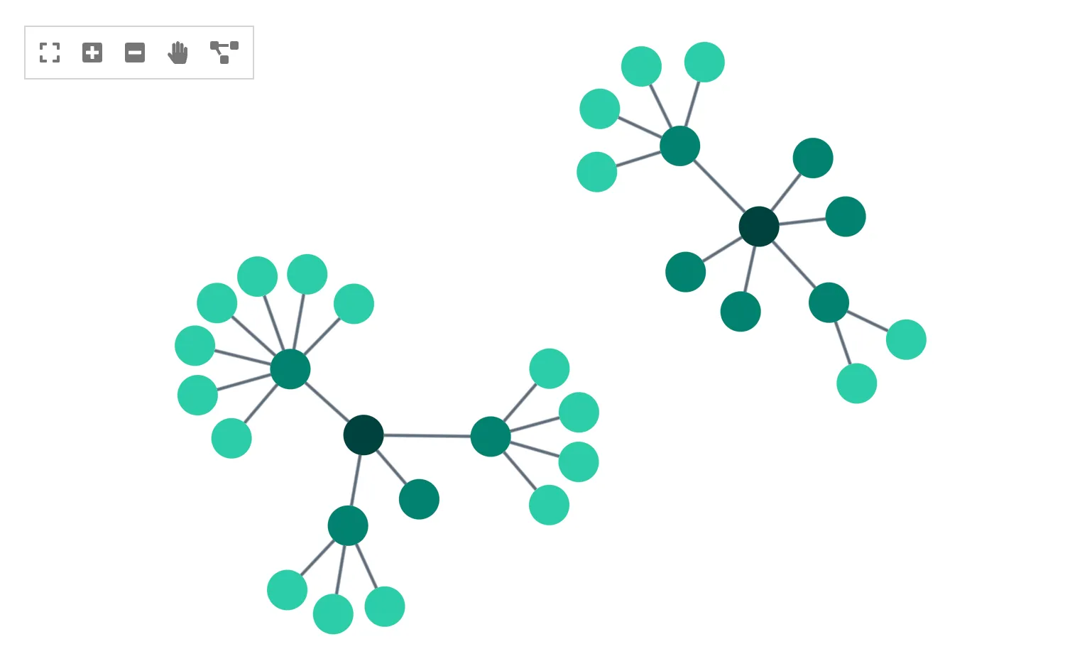
Click on the buttons in the toolbar in the top left to interact with the chart.
The toolbar is a simple JSX element with interactions linked to chart instance methods and state updates.
See also
import React, { useRef, useState } from "react";
import { createRoot } from "react-dom/client";

import { library } from "@fortawesome/fontawesome-svg-core";
import {
  faEdit,
  faExpand,
  faHandPaper,
  faMinusSquare,
  faPlusSquare,
  faProjectDiagram,
} from "@fortawesome/free-solid-svg-icons";
import { FontAwesomeIcon } from "@fortawesome/react-fontawesome";
import { Chart } from "regraph";

import data from "./data";

library.add([
  faExpand,
  faMinusSquare,
  faPlusSquare,
  faEdit,
  faHandPaper,
  faProjectDiagram,
]);

const ToolbarItem = (props) => {
  const { title, icon, onClick } = props;
  return (
    <FontAwesomeIcon
      className="toolbutton"
      title={title}
      icon={icon}
      onClick={onClick}
    />
  );
};

export const Demo = () => <Toolbar items={data()} />;

function Toolbar(props) {
  const [handMode, setHandMode] = useState(true);
  const [positions, setPositions] = useState({});
  const chartRef = useRef(null);

  const { items } = props;

  // methods for the toolbar
  const toggleHandMode = () => {
    setHandMode(!handMode);
  };
  const zoom = (inOrOut) => {
    if (chartRef.current !== null) {
      chartRef.current.zoom(inOrOut);
    }
  };
  const fit = (fitType) => {
    if (chartRef.current !== null) {
      chartRef.current.fit(fitType);
    }
  };
  const layout = () => {
    setPositions({});
  };

  return (
    <div style={{ width: "100%", height: "100%" }}>
      <Chart
        ref={chartRef}
        items={items}
        positions={positions}
        options={{ handMode, navigation: false }}
      />
      <div className="toolbar">
        <ToolbarItem
          title="Fit to window"
          icon={faExpand}
          onClick={() => fit("all")}
        />
        <ToolbarItem
          title="Zoom in"
          icon={faPlusSquare}
          onClick={() => zoom("in")}
        />
        <ToolbarItem
          title="Zoom out"
          icon={faMinusSquare}
          onClick={() => zoom("out")}
        />
        {!handMode && (
          <ToolbarItem
            title="Select mode"
            icon={faEdit}
            onClick={toggleHandMode}
          />
        )}
        {handMode && (
          <ToolbarItem
            style={{ width: 18 }} // gentle hack because the hand icon is smaller
            title="Hand mode"
            icon={faHandPaper}
            onClick={toggleHandMode}
          />
        )}
        <ToolbarItem title="Layout" icon={faProjectDiagram} onClick={layout} />
      </div>
    </div>
  );
}

const root = createRoot(document.getElementById("regraph"));
root.render(<Demo />);import { style } from "@ci/theme/rg/js/storyStyles";
function data() {
return {
1: { ...style.primary1 },
2: { ...style.primary3 },
3: { ...style.primary2 },
4: { ...style.primary2 },
5: { ...style.primary3 },
6: { ...style.primary2 },
7: { ...style.primary1 },
8: { ...style.primary2 },
9: { ...style.primary1 },
10: { ...style.primary2 },
11: { ...style.primary1 },
12: { ...style.primary2 },
13: { ...style.primary1 },
14: { ...style.primary2 },
15: { ...style.primary2 },
16: { ...style.primary1 },
17: { ...style.primary1 },
18: { ...style.primary1 },
19: { ...style.primary1 },
20: { ...style.primary1 },
21: { ...style.primary1 },
22: { ...style.primary1 },
23: { ...style.primary2 },
24: { ...style.primary1 },
25: { ...style.primary1 },
26: { ...style.primary1 },
27: { ...style.primary1 },
28: { ...style.primary1 },
29: { ...style.primary2 },
30: { ...style.primary1 },
31: { ...style.primary1 },
32: { ...style.primary1 },
"3-5": {
id1: "3",
id2: "5",
...style.link,
},
"3-7": {
id1: "3",
id2: "7",
...style.link,
},
"3-9": {
id1: "3",
id2: "9",
...style.link,
},
"3-11": {
id1: "3",
id2: "11",
...style.link,
},
"5-15": {
id1: "5",
id2: "15",
...style.link,
},
"5-23": {
id1: "5",
id2: "23",
...style.link,
},
"5-29": {
id1: "5",
id2: "29",
...style.link,
},
"15-13": {
id1: "15",
id2: "13",
...style.link,
},
"15-17": {
id1: "15",
id2: "17",
...style.link,
},
"15-19": {
id1: "15",
id2: "19",
...style.link,
},
"15-21": {
id1: "15",
id2: "21",
...style.link,
},
"29-32": {
id1: "29",
id2: "32",
...style.link,
},
"29-25": {
id1: "29",
id2: "25",
...style.link,
},
"29-27": {
id1: "29",
id2: "27",
...style.link,
},
"29-31": {
id1: "29",
id2: "31",
...style.link,
},
"29-30": {
id1: "29",
id2: "30",
...style.link,
},
"29-1": {
id1: "29",
id2: "1",
...style.link,
},
"29-24": {
id1: "29",
id2: "24",
...style.link,
},
"2-4": {
id1: "2",
id2: "4",
...style.link,
},
"2-6": {
id1: "2",
id2: "6",
...style.link,
},
"2-8": {
id1: "2",
id2: "8",
...style.link,
},
"2-10": {
id1: "2",
id2: "10",
...style.link,
},
"2-12": {
id1: "2",
id2: "12",
...style.link,
},
"2-14": {
id1: "2",
id2: "14",
...style.link,
},
"4-16": {
id1: "4",
id2: "16",
...style.link,
},
"4-18": {
id1: "4",
id2: "18",
...style.link,
},
"4-20": {
id1: "4",
id2: "20",
...style.link,
},
"4-22": {
id1: "4",
id2: "22",
...style.link,
},
"6-26": {
id1: "6",
id2: "26",
...style.link,
},
"6-28": {
id1: "6",
id2: "28",
...style.link,
},
};
}
export default data;<!doctype html>
<html>
<head>
<link rel="stylesheet" href="./style.css" />
</head>
<body>
<div id="regraph" style="height: 100vh"></div>
<script type="module" src="./code.jsx"></script>
</body>
</html>.toolbar {
display: flex;
align-items: center;
font-family: sans-serif;
position: absolute;
left: 20px;
top: 20px;
background-color: rgba(255, 255, 255, 0.7);
border: solid 1px lightgray;
padding: 2px;
}
.toolbutton {
color: rgb(118, 118, 118);
padding: 8px;
}
.toolbutton:hover {
background-color: #eeeeee;
color: #111111;
}