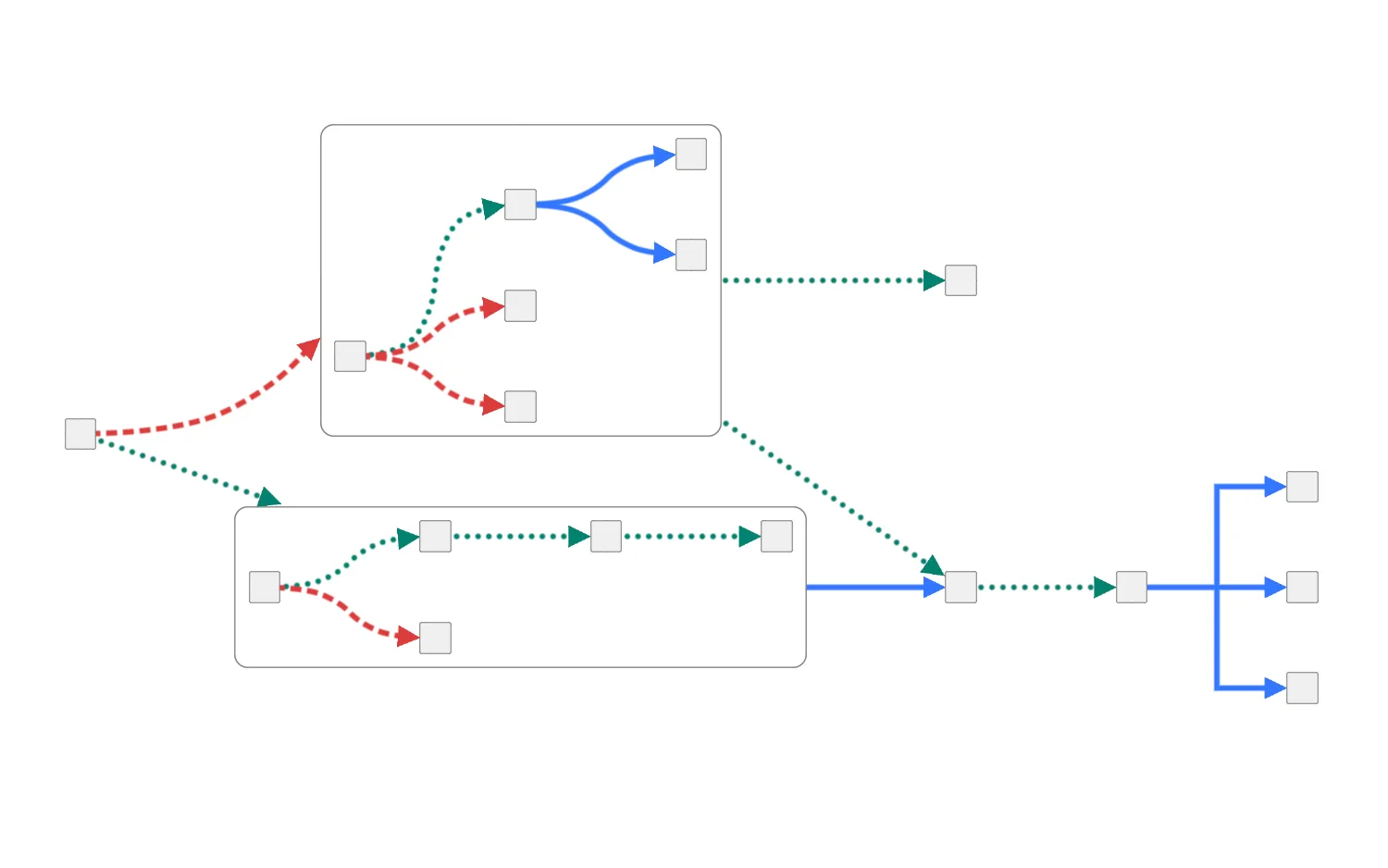
Select a link shape for each set of colored links using the controls across the top of the chart.
Set the checkbox underneath those controls to apply these link shapes within combos. This sets the individual link shapes to override the combo link shape, which is set to 'curved'.
Click on nodes to see their individual content links.
See also
import React, { useEffect, useState } from "react";
import { createRoot } from "react-dom/client";

import { Chart } from "regraph";

import { colors, data } from "./data";

const options = {
  fit: "all",
  navigation: false,
};

const layout = {
  name: "sequential",
  orientation: "right",
  stretchType: "auto",
};

const shapes = ["Direct", "Curved", "Angled"];

const linkColors = ["red", "green", "blue"];

function isLink(item) {
  return "id1" in item;
}

export const Demo = () => <MixedLinkShapes items={data()} />;

function LinkShapeButtonRow({ color, selected, setLinkShapeForColor }) {
  const lowerCaseColor = color.toLowerCase();
  return (
    <div>
      <div>{color}</div>
      <div className="button-row">
        {shapes.map((shape) => {
          const lowerCaseShape = shape.toLowerCase();
          const buttonIsSelected = selected === lowerCaseShape;
          const buttonClassName = `${lowerCaseColor} ${buttonIsSelected ? "selected" : ""}`;
          return (
            <button
              className={buttonClassName}
              key={lowerCaseShape}
              type="button"
              onClick={() =>
                setLinkShapeForColor(lowerCaseColor, lowerCaseShape)
              }
            >
              {shape}
            </button>
          );
        })}
      </div>
    </div>
  );
}

function MixedLinkShapes(props) {
  const { items } = props;
  const [state, setState] = useState({
    items,
    linkShapes: {
      red: "curved",
      green: "direct",
      blue: "angled",
    },
    customLinkShapesInCombos: false,
  });

  // Triggered when 'Apply link shape customization in combos' checkbox is changed
  useEffect(() => {
    for (const color of linkColors) {
      setLinkShapeForColor(color, state.linkShapes[color]);
    }
  }, [state.customLinkShapesInCombos]);

  const onCombineNodesHandler = ({ setStyle }) => {
    setStyle({
      color: "white",
      border: {
        radius: 10,
        width: 1,
      },
      label: { text: "" },
      arrange: { ...layout, linkShape: "curved" },
      open: true,
    });
  };

  const onCombineLinksHandler = ({ setStyle, links }) => {
    const firstChild = Object.values(links)[0];
    setStyle({
      linkShape: firstChild.linkShape,
      color: firstChild.color,
      width: firstChild.width,
      end2: firstChild.end2,
    });
  };

  const setLinkShapeForColor = (color, shape) => {
    const updatedLinks = {};

    for (const [id, item] of Object.entries(state.items)) {
      if (isLink(item) && item.color === colors[color]) {
        const node1 = state.items[item.id1];
        const node2 = state.items[item.id2];

        // Check whether the current link is between two combo children
        const isLinkInCombo =
          node1?.data?.group !== undefined && node2?.data?.group !== undefined;

        // Link shape is explictly set to null to prioritize the link shape specified in
        // the combo's arrangement
        const linkShape =
          isLinkInCombo && !state.customLinkShapesInCombos ? null : shape;

        updatedLinks[id] = {
          ...item,
          linkShape: {
            name: linkShape,
          },
        };
      }
    }

    setState((current) => {
      return {
        ...current,
        items: {
          ...current.items,
          ...updatedLinks,
        },
        linkShapes: {
          ...current.linkShapes,
          [color]: shape,
        },
      };
    });
  };

  return (
    <div className="story">
      <div id="options">
        <div>
          <LinkShapeButtonRow
            color="Red"
            selected={state.linkShapes.red}
            setLinkShapeForColor={setLinkShapeForColor}
          />
          <LinkShapeButtonRow
            color="Green"
            selected={state.linkShapes.green}
            setLinkShapeForColor={setLinkShapeForColor}
          />
          <LinkShapeButtonRow
            color="Blue"
            selected={state.linkShapes.blue}
            setLinkShapeForColor={setLinkShapeForColor}
          />
        </div>
        <label
          htmlFor="custom-link-shapes-in-combos-checkbox"
          className="container"
        >
          Apply link shape customization in combos
          <input
            type="checkbox"
            id="custom-link-shapes-in-combos-checkbox"
            defaultChecked={state.customLinkShapesInCombos}
            onChange={(e) => {
              // trigger the useEffect that applies link customization for links in combos
              setState((current) => ({
                ...current,
                customLinkShapesInCombos: e.target.checked,
              }));
            }}
          />
          <span className="checkmark" />
        </label>
      </div>
      <div className="chart-wrapper">
        <Chart
          items={state.items}
          layout={layout}
          options={options}
          combine={{
            shape: "rectangle",
            level: 1,
            properties: ["group"],
          }}
          onCombineNodes={onCombineNodesHandler}
          onCombineLinks={onCombineLinksHandler}
        />
      </div>
    </div>
  );
}

const root = createRoot(document.getElementById("regraph"));
root.render(<Demo />);import { style } from "@ci/theme/rg/js/storyStyles";
export const colors = {
green: style.colors.teal2,
red: style.colors.red2,
blue: style.colors.blue2,
lightGray: "rgb(240, 240, 240)",
gray: "gray",
};
export function data() {
return {
1: {
color: colors.lightGray,
shape: "box",
border: {
radius: 5,
color: colors.gray,
width: 2,
},
size: 0.4,
},
2: {
data: {
group: 1,
},
color: colors.lightGray,
shape: "box",
border: {
radius: 5,
color: colors.gray,
width: 2,
},
size: 0.4,
},
3: {
data: {
group: 1,
},
color: colors.lightGray,
shape: "box",
border: {
radius: 5,
color: colors.gray,
width: 2,
},
size: 0.4,
},
4: {
data: {
group: 1,
},
color: colors.lightGray,
shape: "box",
border: {
radius: 5,
color: colors.gray,
width: 2,
},
size: 0.4,
},
5: {
data: {
group: 1,
},
color: colors.lightGray,
shape: "box",
border: {
radius: 5,
color: colors.gray,
width: 2,
},
size: 0.4,
},
6: {
data: {
group: 1,
},
color: colors.lightGray,
shape: "box",
border: {
radius: 5,
color: colors.gray,
width: 2,
},
size: 0.4,
},
7: {
data: {
group: 1,
},
color: colors.lightGray,
shape: "box",
border: {
radius: 5,
color: colors.gray,
width: 2,
},
size: 0.4,
},
8: {
data: {
group: 2,
},
color: colors.lightGray,
shape: "box",
border: {
radius: 5,
color: colors.gray,
width: 2,
},
size: 0.4,
},
9: {
data: {
group: 2,
},
color: colors.lightGray,
shape: "box",
border: {
radius: 5,
color: colors.gray,
width: 2,
},
size: 0.4,
},
10: {
data: {
group: 2,
},
color: colors.lightGray,
shape: "box",
border: {
radius: 5,
color: colors.gray,
width: 2,
},
size: 0.4,
},
11: {
data: {
group: 2,
},
color: colors.lightGray,
shape: "box",
border: {
radius: 5,
color: colors.gray,
width: 2,
},
size: 0.4,
},
12: {
data: {
group: 2,
},
color: colors.lightGray,
shape: "box",
border: {
radius: 5,
color: colors.gray,
width: 2,
},
size: 0.4,
},
13: {
color: colors.lightGray,
shape: "box",
border: {
radius: 5,
color: colors.gray,
width: 2,
},
size: 0.4,
},
14: {
color: colors.lightGray,
shape: "box",
border: {
radius: 5,
color: colors.gray,
width: 2,
},
size: 0.4,
},
15: {
color: colors.lightGray,
shape: "box",
border: {
radius: 5,
color: colors.gray,
width: 2,
},
size: 0.4,
},
16: {
color: colors.lightGray,
shape: "box",
border: {
radius: 5,
color: colors.gray,
width: 2,
},
size: 0.4,
},
17: {
color: colors.lightGray,
shape: "box",
border: {
radius: 5,
color: colors.gray,
width: 2,
},
size: 0.4,
},
18: {
color: colors.lightGray,
shape: "box",
border: {
radius: 5,
color: colors.gray,
width: 2,
},
size: 0.4,
},
"1-2": {
id1: 1,
id2: 2,
width: 4,
color: colors.red,
lineStyle: "dashed",
end2: {
arrow: true,
},
},
"2-3": {
id1: 2,
id2: 3,
width: 4,
color: colors.green,
lineStyle: "dotted",
end2: {
arrow: true,
},
},
"2-4": {
id1: 2,
id2: 4,
width: 4,
color: colors.red,
lineStyle: "dashed",
end2: {
arrow: true,
},
},
"2-5": {
id1: 2,
id2: 5,
width: 4,
color: colors.red,
lineStyle: "dashed",
end2: {
arrow: true,
},
},
"3-6": {
id1: 3,
id2: 6,
width: 4,
color: colors.blue,
end2: {
arrow: true,
},
},
"3-7": {
id1: 3,
id2: 7,
width: 4,
color: colors.blue,
end2: {
arrow: true,
},
},
"7-13": {
id1: 7,
id2: 13,
width: 4,
color: colors.green,
lineStyle: "dotted",
end2: {
arrow: true,
},
},
"6-14": {
id1: 6,
id2: 14,
width: 4,
color: colors.green,
lineStyle: "dotted",
end2: {
arrow: true,
},
},
"1-8": {
id1: 1,
id2: 8,
width: 4,
color: colors.green,
lineStyle: "dotted",
end2: {
arrow: true,
},
},
"8-9": {
id1: 8,
id2: 9,
width: 4,
color: colors.green,
lineStyle: "dotted",
end2: {
arrow: true,
},
},
"8-10": {
id1: 8,
id2: 10,
width: 4,
color: colors.red,
lineStyle: "dashed",
end2: {
arrow: true,
},
},
"9-11": {
id1: 9,
id2: 11,
width: 4,
color: colors.green,
lineStyle: "dotted",
end2: {
arrow: true,
},
},
"11-12": {
id1: 11,
id2: 12,
width: 4,
color: colors.green,
lineStyle: "dotted",
end2: {
arrow: true,
},
},
"12-14": {
id1: 12,
id2: 14,
width: 4,
color: colors.blue,
end2: {
arrow: true,
},
},
"14-15": {
id1: 14,
id2: 15,
width: 4,
color: colors.green,
lineStyle: "dotted",
end2: {
arrow: true,
},
},
"15-16": {
id1: 15,
id2: 16,
width: 4,
color: colors.blue,
end2: {
arrow: true,
},
},
"15-17": {
id1: 15,
id2: 17,
width: 4,
color: colors.blue,
end2: {
arrow: true,
},
},
"15-18": {
id1: 15,
id2: 18,
width: 4,
color: colors.blue,
end2: {
arrow: true,
},
},
};
}<!doctype html>
<html>
<head>
<link rel="stylesheet" href="./style.css" />
</head>
<body>
<div id="regraph" style="height: 100vh"></div>
<script type="module" src="./code.jsx"></script>
</body>
</html>@import "@ci/theme/rg/css/variables.css";
#options {
padding: 6px;
> div {
display: flex;
gap: 8px;
flex-wrap: wrap;
color: black;
}
> div > div {
align-items: stretch;
flex: 0 1 30%;
}
}
.button-row {
display: flex;
> button {
color: white;
background-color: rgb(240, 240, 240);
margin: 0px;
border: none;
border-radius: 0px;
width: 100%;
}
button:not(.selected) {
color: black;
}
}
button.red:not(.selected):hover {
background-color: #f15d5b;
}
button.red.selected {
background-color: #dd3c3c;
}
button.green:not(.selected):hover {
background-color: #2dcda8;
}
button.green.selected {
background-color: #048170;
}
button.blue:not(.selected):hover {
background-color: #6699ff;
}
button.blue.selected {
background-color: #3377ff;
}
/* Checkbox styling */
.link-shape-control {
> label {
margin-right: 4px;
}
}
label.container {
margin: 12px 0px;
width: 300px;
}
.container:hover input ~ .checkmark {
background-color: #ccc;
}
.container:hover input:checked ~ .checkmark {
background-color: var(--primary1);
}