- Links between nodes in a single-level sequential layout are now always drawn correctly.
7.8.1
7.8.0
Add images to labels!

You can now include images directly into your labels, giving you even more freedom to easily create unique, customised nodes.
Image labels can also be used in combination with other types of labels, so you can create beautiful, coherent, composite node labels made up of text, font icons and images.
Visit the Advanced Node Styles demo to see examples of how image labels can be used as a building block to create complex, meaningful node labels.
New tutorials to get you started quicker
To improve developer experience for anyone building their first application with KeyLines, we are modernising a number of tutorials from our Using KeyLines with... suite. Here are some of the changes we've made to our Javascript and Angular tutorials to make them even more helpful:
- The Javascript tutorial now uses Vite as a build tool to benefit from the package manager's quick setup and modern development features.
- Both tutorials now show how to transform your raw data into a KeyLines-required format.
- Both guides now have even more useful content, including steps for visualising item metadata and styling the chart with chart options.
- You can now copy all code snippets to your clipboard easily by clicking the
 button in the top-right corner of each code block.
Find out more in our Using KeyLines with Javascript and Using KeyLines with Angular guides.
Enhancements
- The number of images and font icons that KeyLines supports in WebGL is now limited only by the user's hardware. KeyLines will performantly display up to 900 distinct images and font icons. Using more than this is not recommended as it may affect chart rendering performance. See WebGL Recommendations.
Bug Fixes
- Nodes with dimensions set to 'auto', containing multiple positioned labels, are now sized correctly around their labels.
- The TypeScript types for the
overviewandnavigationchart options now correctly accept Boolean values. - Links between nodes in a single-level sequential layout are now always drawn correctly. (7.8.1. patch)
7.7.0
Bug Fixes
- Closed combos with font icon or image styling no longer move chart items unnecessarily when opened and closed repeatedly.
7.6.0
Expand your KronoGraph experience
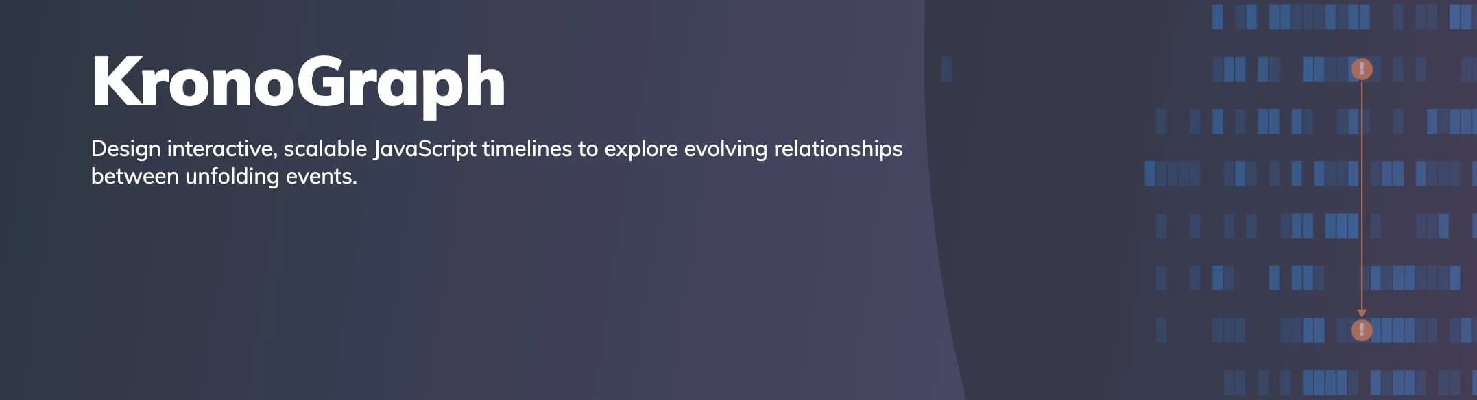
Graph and timeline visualisations are a match made in heaven - they both have their unique strengths that can work together to create intuitive and versatile analysis tools.
If you want to learn more about KronoGraph, our timeline visualisation product, and also explore how seamlessly it can be integrated with KeyLines, head to our new Try KronoGraph page.
The new page contains an introduction to help you understand KronoGraph's main features, and also gives you access to a number of KronoGraph demos that feature both KronoGraph and KeyLines - Phone Call Analysis (formerly Timelines with KronoGraph demo on our site), Network Traffic Analysis and Anti-money Laundering.
You can visit this page any time by clicking the banners on the Welcome page and Demos page, or by clicking on the Timelines with KronoGraph demo thumbnail.
Enhancements
- We've made improvements to the packing algorithm which means that using 'circle' or 'adaptive' packing may now be up to 40% faster for large datasets.
- KeyLines now fully supports Leaflet versions 1.9.x.
Bug Fixes
- Uncombining a combo, or transferring some of its child nodes out, now correctly resets the offsets of any links to its children.
- Opening and closing combos with very large numbers of children is now more performant.
- An aggregate link is no longer created if its id is already in use by a non-aggregate link, and a warning is shown.
- Nodes with dimensions set to 'auto' are now sized correctly when they contain labels with
textWrapset to 'normal'.- We've fixed some issues where child items or their decorations were not always fully contained within the parent combo's boundaries.
7.5.2
- Resizing a window on MacOS machines with a specific hardware setup no longer draws temporary artefacts on the chart.
7.5.1
- Our recommended version of PDFKit for PDF export is now v0.14.0. If you are using the previous recommended version 0.12.1, we encourage you to update to v0.14.0 as it addresses a vulnerability in a dependency of PDFKit.
7.5.0
Sequential arrangement in open combos
Sequential is the most advanced layout for viewing and exploring tiered data: it is great at automatically placing nodes in the best positions, and can be customised in many ways. The new sequential arrangement now unlocks all of these possibilities for combos too, and lets you drill down into sub-hierarchies within your data.
You can set the sequential combo arrangement in the arrange option of the arrange(), combine() and transfer() combo functions, and also in the arrange option of chart.expand(). The arrange object accepts any options available for customising sequential layout including level, orderBy and others.
We've also added a new stretchType option for both sequential layout and arrangement that controls how individual levels are distributed when they contain items with varying sizes.
See the sequential arrangement in our updated Combo Options demo, or head to the Cloud Security demo which now uses the sequential arrangement to organise open combos and make them easier to interpret.
Smooth and adaptive sequential layout
Our sequential layout is now even better at handling data changes and small layout changes, making it more consistent and easier to follow even for dynamically changing datasets.
When running a full sequential layout using chart.layout(), setting the mode option to 'adaptive' ensures that sequential makes only necessary movements to adjust to data changes and preserves the relative positions of existing items in the component.
The improved behaviour is also applied by default when using chart.expand() to add new items, and results in much smaller and more incremental changes to the layout.
See the improved behaviour in the Adaptive Layouts demo.
Setting link shape inside open combos
We've redesigned and improved the way you can specify shapes of link paths in the chart.
While previously you could only set link path shape at the whole chart level, you can now use the new linkShape API to set it separately at chart level using chart.layout() or chart.expand(), and also at combo level using chart.combo().arrange(), and the arrange option for chart.combo().combine() and chart.combo().transfer().
When the linkShape option is set to 'curved', the orientation of curved links in the layout or inside open combos is automatically aligned with the relevant orientation option.
Enhancements
- PDF export is now more robust as it no longer requires using blob-stream as a dependency, and it is easier to use especially when passing a custom
PDFDocument. See it in the updated PDF Reports demo.
Deprecations
We've added some legacy APIs to our list of deprecations:
- We've deprecated
pathoption forlinkStyleinchart.options(). Use the newlinkShapeAPI instead.
Bug Fixes
- KeyLines now meets strict CSP directive for
style-src. - Using
chart.show()on very large networks using combos is now more performant. - Updating a node font icon using
chart.animateProperties()now works as expected. - Uncombining multiple combos connected by large numbers of links is now more performant.
- The TypeScript definition of
chart.getItem()return types for a node now correctly includesxandyas required.
7.4.1
- The overview window contents is now correctly drawn over the chart in WebGL.
- Aggregate links between nodes that are combined or uncombined are now always displayed correctly.
- Deleting a node at one end of an aggregate link now correctly fires a
link-aggregationevent.
7.4.0
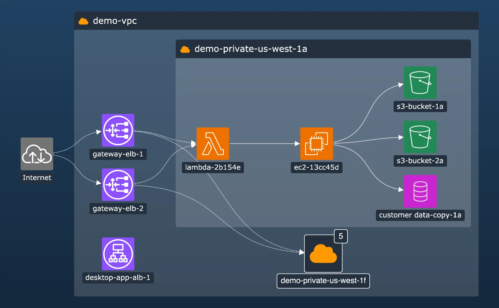
New level of styling unlocked for open combos!
In this release, we bring you three beta features that we think you'll love - styling for open combos, glyphs for open combos and link aggregation.
Open combos now support all of the styling features of the 7.0 Node Customisation release! Now you can organise your data while maintaining a consistent look and feel with the rest of your chart and application, by using features such as:
- adding multiple labels on open combos
- customising labels using the rich styling API
- setting precise label positions with positioning API
We've added a new Cloud Security demo and updated our Network Alerts demo to show you examples of open combo labels. You can also head to the new Advanced combo styling documentation for more details, or see the changes in the oc property for open combo styling.
Based on a popular feature request, we've included a simple way to create a bar label that fills the whole height or width of a rectangular node or a rectangular open or closed combo. This label adjusts to any combo size but doesn't get overlapped by combo content, making it perfect to use for example as a header.
To turn a label into a bar label, simply set it to minWidth: 'stretch' or minHeight: 'stretch'.
And to round off the styling enhancements, we've also added a borderRadius property on open combos. This means that if your application design features rectangular shapes with rounded corners, you can now keep the corner styling consistent across labels, nodes, and open and closed combos alike.
You can find all the new features in our new Cloud Security demo that uses cloud infrastructure data and features modern rectangular design with rounded corners and styled labels.
Glyphs on open combos
Glyphs are a powerful and versatile design element - you can use them as decoration, a source of information, but also as an interactive control with customisable actions.
Now you can take advantage of this also when styling your open combos. Add your glyphs in the g property for open combo styling and style and position them in the same versatile way as glyphs on closed combos.
The default red counter glyph is hidden on open combos. If you want to display it, you can set the comboGlyphOnOpen option to true.
If you happen to style nodes or combos with both glyphs and labels, you might find it useful to control their drawing order. By default, labels are drawn over glyphs, but if you set the legacyGlyphAndLabelOrdering option to false, the order will reverse and glyphs will be drawn over labels.
See the new glyphs in our Social Media Analysis demo, which has been treated to a complete styling overhaul.
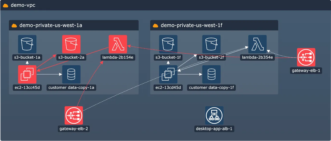
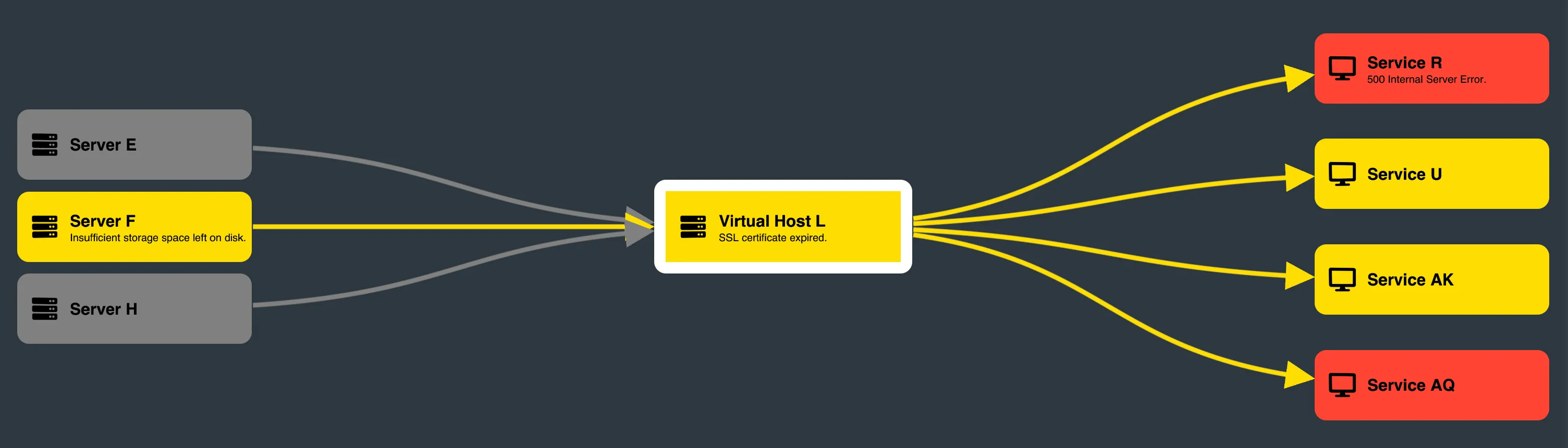
Prune cluttered links with link aggregation
Our new link aggregation feature makes your chart clearer by summarising links between the same pairs of nodes or combos.
These aggregate links represent their child links and visually reduce the number of connections in the chart, but still contain all the data about the underlying links. You can turn on link aggregation in your chart by setting the aggregateLinks option to true.
If you have different types of links in your chart, you can also use the aggregateBy option to create more granular aggregation rules, and also set the aggregateByDirection option to create an aggregate link for each direction.
Aggregate links can be styled, for example to make them more informative at a glance by adding a dynamic width or a summary glyph, or to match them with an existing chart styling. Styling of aggregate links can be done in the event handler of the new link-aggregation event.
Head to the new Aggregating Links demo to try out different aggregating options, or read more about this feature in the new Aggregate Links documentation page.
Important information about beta features
- li(style="font-weight: bold"). All of the features in this release (styling for open combos, glyphs for open combos and link aggregation) are currently in beta. You can share any feedback by contacting us.
- We have changed the default alignment of label borders which is in beta from 7.0. The inside of the label border is aligned with the inside of the parent node/combo border. Previously, the outside of the label border was aligned. To get the previous label position, add a label margin that equals to the label's border width. For more details or help, please contact us.
Bug Fixes
- Setting the
tilesmap option repeatedly while also repeatedly showing/hiding map withshow()andhide()no longer causes issues.
7.3.1
- Loading a chart fires a single
view-changeevent. - Fixed various issues with bands and watermarks.
- Combo size is always calculated correctly when a combo is closed.
- The
chart.worldCoordinates()function now correctly rounds outputs. - Opening and closing large combos with
adaptset to 'all' is now faster. - Offsets of revealed combo links are calculated and drawn correctly regardless of the values of ids in
end1andend2. - Changing the
tightnessinside a combo with a concentric arrangement no longer causes unexpected movement of child items. - Loading items into chart using
chart.expand()withanimateset to false no longer causes unexpected movement. - The 'sans-serif' font is always used by default when a custom font is set incorrectly or doesn't exist and fails to load into the chart.
- Updating a label for combo using
chart.setProperties()now correctly updates the label for both closed and open combo states.
7.3.0
Access information from multiple sources with the new site search
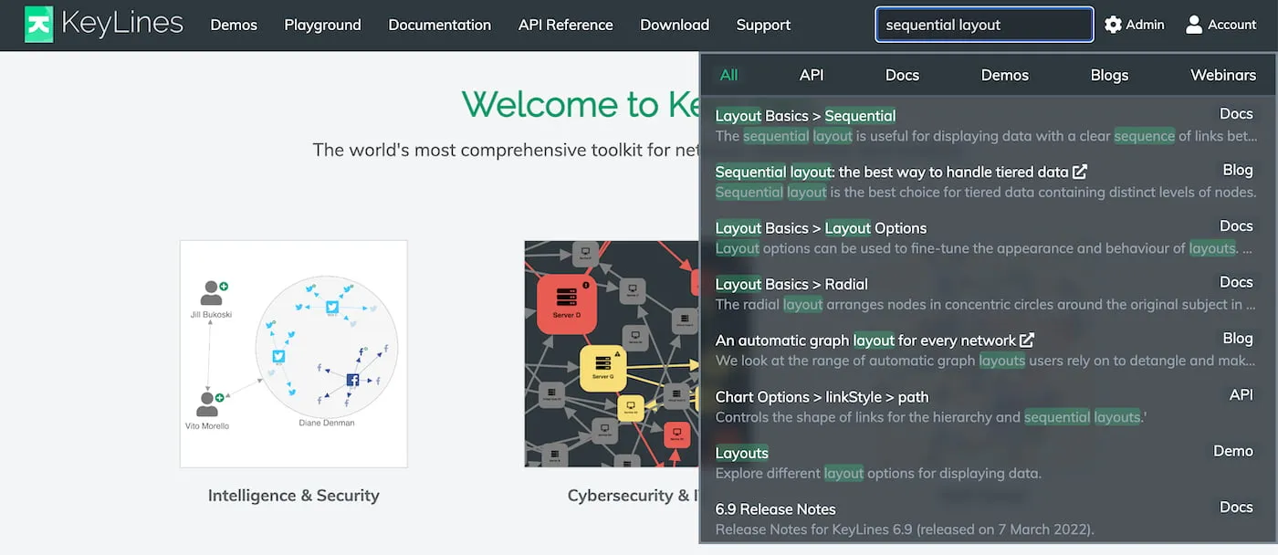
The KeyLines SDK site is a rich source of information about our features ranging from interactive demos to detailed documentation. To make sure you can access all the information quickly and easily, we've added a new site-wide search box in the top navigation bar that displays search results from the entire SDK site.
In addition to this, it also includes relevant Cambridge Intelligence blog posts and webinars so you don't miss out on any useful information from our website.
Enhancements
- We've made significant improvements to performance when adding datasets with a very large number of links into the chart using
merge(). - We've addressed an issue caused by a change to our existing external source of default map tiles. As a result, KeyLines now uses OpenStreetMap, licensed under the ODbL License, as the default map tile provider. We recommend that you set your own provider in the tiles property or check that your use is in accordance with the Tile Usage Policy before you deploy your charts with map mode to production.
Bug Fixes
- Exporting charts with curved links and colour gradients no longer causes an error.
- Panning and zooming a chart containing a large number of open combos is now more performant.
- Using the sequential layout with a
tightnessvalue of 4 or less now produces the expected amount of space between items.
7.2.0
Rectangular combos in top shape and out of beta!
After a period of improving, testing and implementing your feedback, rectangular combos are now officially in General Availability as an established part of KeyLines.
In this release, we have made rectangular combos even more customisable with the new tightness option for combos. Available for both circular and rectangular combos, tightness lets you control how tight or spread out the items are when they're arranged inside the open combo.
The new API is available for arrange(), combine() and transfer() combo functions, and also for the arrange option of chart.expand().
Try out different combo combinations with tightness in the updated Combo Options demo, and see how we integrated the option in the Arranging IT Networks demo.
Improvements to layout tightness
- When you specify a tightness setting for a structural layout, the spacing between leaf nodes now also reflects this. Explore these changes in the updated Layouts demo.
- Similarly, when you specify a tightness setting for a sequential layout, with the stacking option set to grid, the spacing between the stacked nodes now also reflects this.
Bug Fixes
- Using
chart.expand()to add a large number of items to a combo no longer causes a performance issue. - Zooming with very small bordered labels in WebGL now produces consistent results at all levels.
- Loading images into a chart that uses
adaptiveStylingno longer causes a brief opaque flicker. - Using the KeyLines Angular component in angular-keylines.ts within an Angular application no longer causes repeated triggering of Angular's change detection.
- KeyLines package downloads no longer occasionally report an error when unpacked.
7.1.0
Sequential layout improvements
Control over items order in sequential
The orderBy property available for the sequential layout when running chart.layout() or chart.expand() now offers even more flexibility when ordering your items within the sequential's levels. The property can now also be set to an object that accepts a new sortBy option where you can set whether the order should be ascending or descending.
Try it out in the updated Display Hierarchies demo.
Sequential layout performance improvements
We've improved the way sequential layout automatically calculates positions of nodes in the hierarchy if no distinct levels are set. As a result, running a sequential layout with no set levels is now typically 2x - 5x faster.
React Integration demo with font icons and tooltips
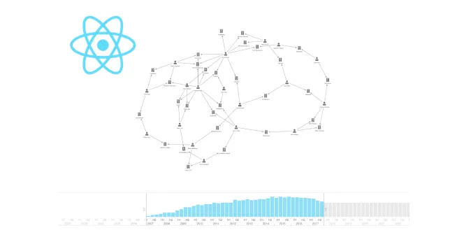
The former 'React Integration' and 'React Integration: Time' demos are now merged into a single React Integration demo which now also uses font icons and tooltips to help you implement even more features.
Enhancements
- We've made some performance improvements to animation of nodes containing multiple labels.
- Even more demos now use our advanced label styling API, such as Map Layers, Insurance Fraud Analysis and Credit Card Fraud demos.
- We've made some improvements to the Featured Documentation page and improved the categorisation of items in its left-hand navigation sidebar.
Bug Fixes
Fixed an issue where setting node
widthandheightto 0 for certain nodes in a chart could sometimes make the chart unresponsive.Fixed some issues where fading effect during adaptive styling wasn't correctly applied on some elements.
Fixed an issue where running an organic layout with
modeset to 'adaptive' on very large networks could sometimes make the chart unresponsive.Fixed an issue where revealed links were backgrounded with a different background alpha opacity than regular links.
Fixed an issue where positioning a label using
{ vertical: 'inherit' }didn't have any effect when it followed a label positioned with a compass point value.
7.0.1
- Fixed an issue where simultaneously adding items with partial or invalid styling into new and existing combos could make the chart unresponsive.
- Fixed an issue where combining a child combo inside an unstyled parent combo could sometimes override the parent combo open label with the child combo open label.
7.0.0
KeyLines 7.0 - A new era of node styling
If you can design it, we'll help you implement it
With design and UX departments often involved in the early stages of development, integrated development kits are under close scrutiny to align with the design language of their customers' applications, and to provide an intuitive user interface and a great user experience. This is where KeyLines 7.0 comes in - to help you implement any design vision without compromises.
To complement designs with modern shapes, we're introducing new rectangular nodes. These nodes, which can even by styled to have one or more rounded corners, retain the same adaptive abilities and behaviour as the default circle nodes. In addition, they offer even more space to display information and look especially sleek in combination with our rectangular combos or with our sequential layout.
We've also made two major improvements to node labels and their styling, making labels the pefect tool for infinitely flexible node customisation. These improvements are adding the option to create multiple labels on a node and adding an extensive label styling API. With these two improvements, you can now get more information-rich and styling-rich nodes that will make your charts fit seamlessly into your application.
And last but not least, because nodes can now have any number of labels, labels can now also be a lot more than just a source of information. You can use them to add the finishing touches to your node styling, or even use them as user interface elements with custom interactions and interaction styling.
Sounds good so far? Here are some more details:
New rectangular nodes
To create rectangular nodes, set their width and height in the w and h properties. You can also set a custom radius to make one or multiple corners rounded using the borderRadius property.
For examples of rectangular nodes, head to our new Advanced Node Styles and Detail on Zoom demos, or see the updated Impact Analysis and Arranging IT Networks demos.
Unlocking the multiple label API
The existing t property has been updated to enable adding multiple text or font icon labels on a node. While previously, the property only accepted a string as a label, the t property now also accepts an array of objects where each object is a node label.
In a t property array of objects, each object can have a nested t string property, making it a text label, or an fi property, making it a font icon label. In addittion to these, each label object can contain additional styling properties from our new node label API to further style the text label or the font icon.
To see what the new API looks like, take a look at the examples in the brand new Advanced Node Styles demo or in the updated Node Styles demo.
Advanced label styling
We've added a number of new properties to give you more flexibility when styling your node labels. With the new APIs, you can for example:
- Place the labels exactly where you want them inside or outside nodes using the position property.
- Fine-tune the look of labels inside nodes by adding custom padding and margin and control their content with the textWrap property.
- Keep the label size optimised regardless of its content by setting the fs property to 'auto', and by using the minHeight, maxHeight, minWidth and maxWidth properties.
The list doesn't end there - for a full list of what's new, go to the Node Label API Reference or our new Advanced label styling documentation.
Adding custom actions to labels
As you're no longer limited with the number of labels your nodes can have, you can use labels to complete or even change the styling of your node, add unique elements, or add user interface elements you couldn't achieve before. Here's a few outside-the-box examples of what labels can also be:
- multicolour node background (an empty label with set fbc used as a colour block)
- progress bars or stack bars (a label whose width changes depending on the value in the node's d property)
- buttons with custom interaction styling (using the click and hover events)
Get started with the new APIs
The multiple label and label styling APIs are straightforward to use whether you're starting from scratch or updating an existing code.
To enable multiple label API and flexible label styling, wrap your existing label or font icon inside an object and place it in a t property array of objects, for example:
t: [
    { t: 'label1' },
    { fi: { t: KeyLines.getFontIcon('fa-user') } }
]
For more examples and a full list of new APIs, see the Node Label API Reference.
Note that multiple label API and label styling API are currently in beta. You can share any feedback by contacting us.
Enhancements
- Asynchronous functions are now promisified by default. If you're using KeyLines with promises, you don't need
KeyLines.promisify()anymore. You don't have to change your code but you can remove your call to the function. If you want to continue using callbacks, see Using KeyLines with callbacks. - The value of the
dproperty is no longer deep cloned when the property is imported to the chart model or retrieved from it, improving the memory usage and performance of KeyLines. - Organic, our recommended force-directed layout, is now the default layout when running chart.layout() or chart.expand() without a set layout.
- If a chart background colour is set in the backColour property, the same colour is set by default in the overview window backColour property.
- We've added a number of Playground improvements such as an option to format code in the Code and Data tabs using Prettier.
- KeyLines now uses Leaflet v1.9.1.
Bug Fixes
- Fixed an issue with using
chart.serialize()on charts in map mode. - Fixed an issue where warning advising the use of 'willReadFrequently' was appearing in the developer console.
- Fixed an issue where donuts inside combos didn't scale correctly during open/close combo animations.
- Fixed an issue where removing a donut border on a closed combo by setting the
bwproperty to 0 also removed the border of an open combo. - Fixed an issue where information about nodes returned by
chart.combo().info()didn't containdproperties whose values started with an underscore.
Breaking API Changes
Like our previous major releases, KeyLines 7.0 contains some breaking changes. Without them, we couldn't evolve KeyLines and deliver the features you want. We recommend reading 7.0 Breaking Changes carefully before you install this version.
Deprecations
We've added some legacy APIs to our list of deprecations:
- 'standard' and 'tweak' layouts
- KeyLines shape nodes
tcnode propertyreoptionchart.contains()function
If any of these features are important to you, please contact us so we can prioritise them.
End of Support
- KeyLines support for Internet Explorer 11 has now ended.
- KeyLines 4.8 LTA support has now ended and and the version has been removed.