What the showcase demonstrates

The showcase visualizes around 240,000 AIS observation points from a week of marine traffic around US coastal waters. Instead of presenting those observations as isolated points, it infers vessel trajectories so users can see how routes form, where traffic concentrates and when a pattern starts to look unusual.
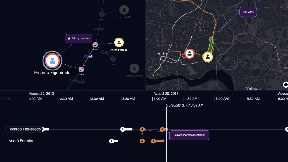
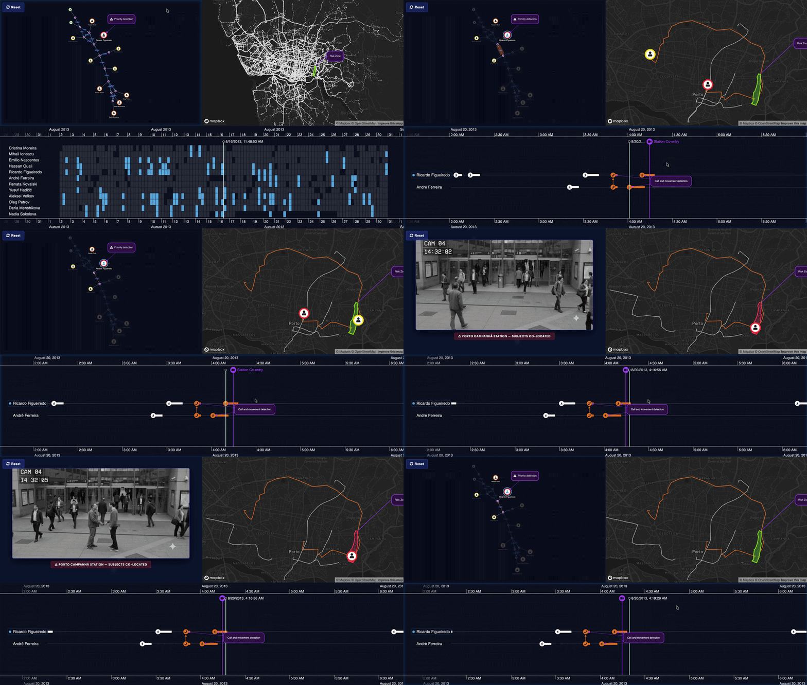
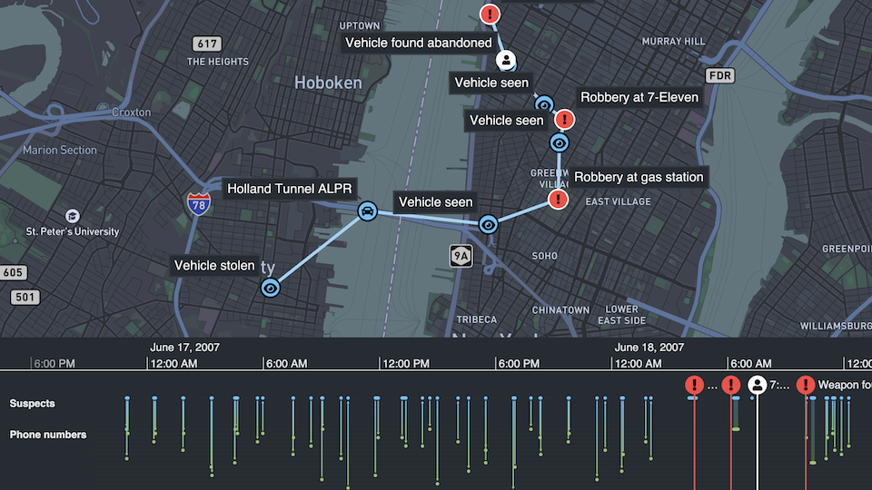
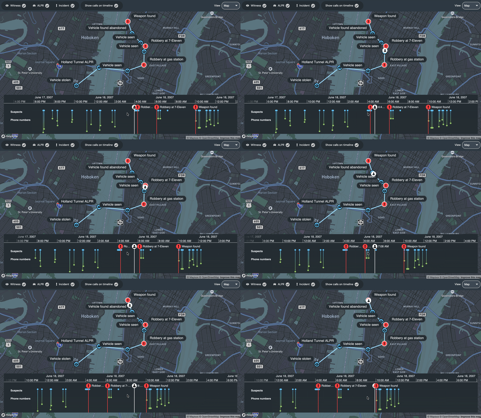
A time bar lets users move through the dataset and watch the maritime picture change. White tracker nodes show vessel positions at selected moments, while yellow alerts highlight behavior that could indicate a ship-to-ship transfer. Selecting a vessel or alert brings related trajectories into focus, making it easier to follow a specific route without losing the wider geographic context.
What you can evaluate
For product and engineering teams, this showcase demonstrates how MapWeave can support large-scale geospatial analysis. It highlights AIS data visualization, trajectory rendering, time-based exploration, map interaction and event alerting over satellite imagery. Explore this showcase to evaluate whether this kind of interactive map-based workflow could help your users monitor maritime data to investigate anomalies and understand vessel behavior in your own application.
The workflow supports a core pattern-of-life task: establish what normal movement looks like, then focus attention on the events that stand out.