What the showcase demonstrates
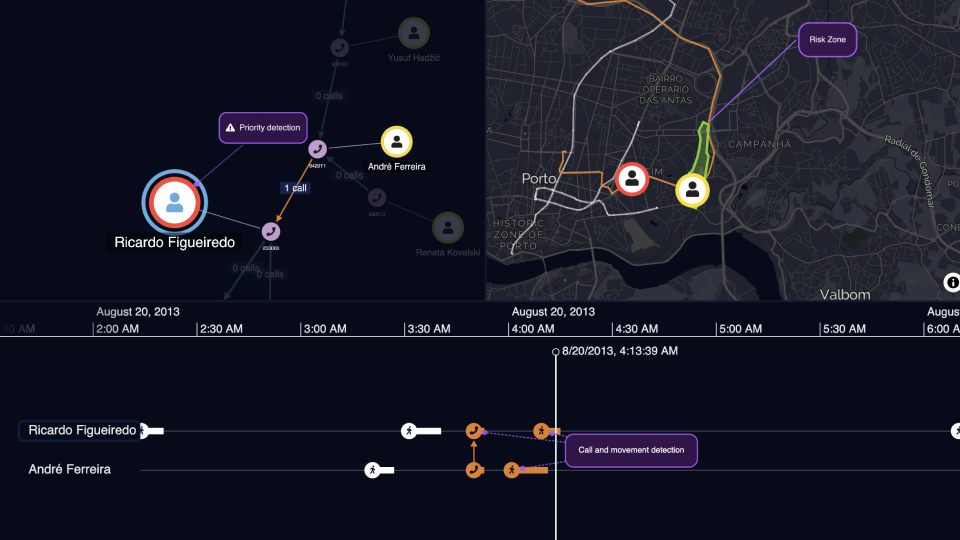
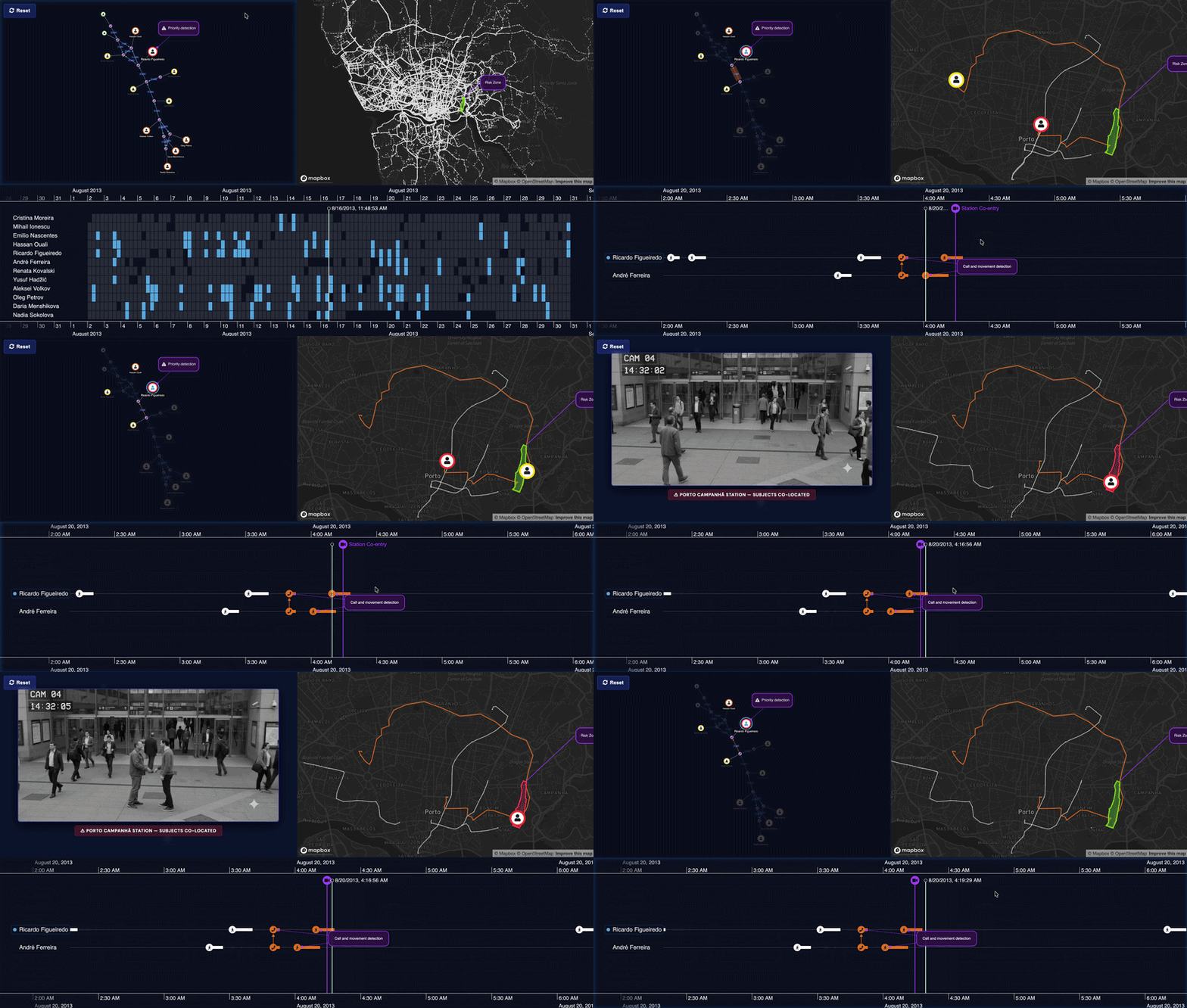
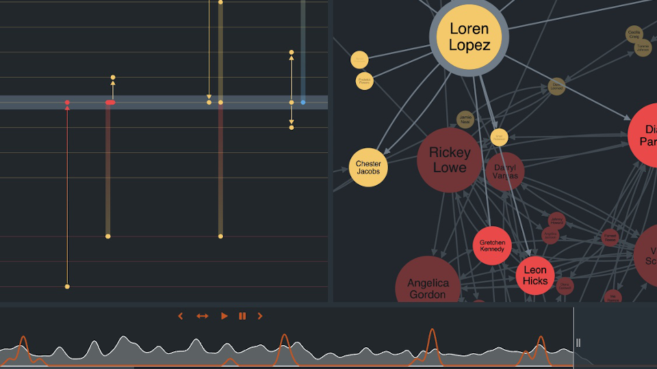

The showcase begins with the timeline component itself, shown as part of a web application. In the example, emails are arranged against a time scale, with each row representing a person involved in the communication.
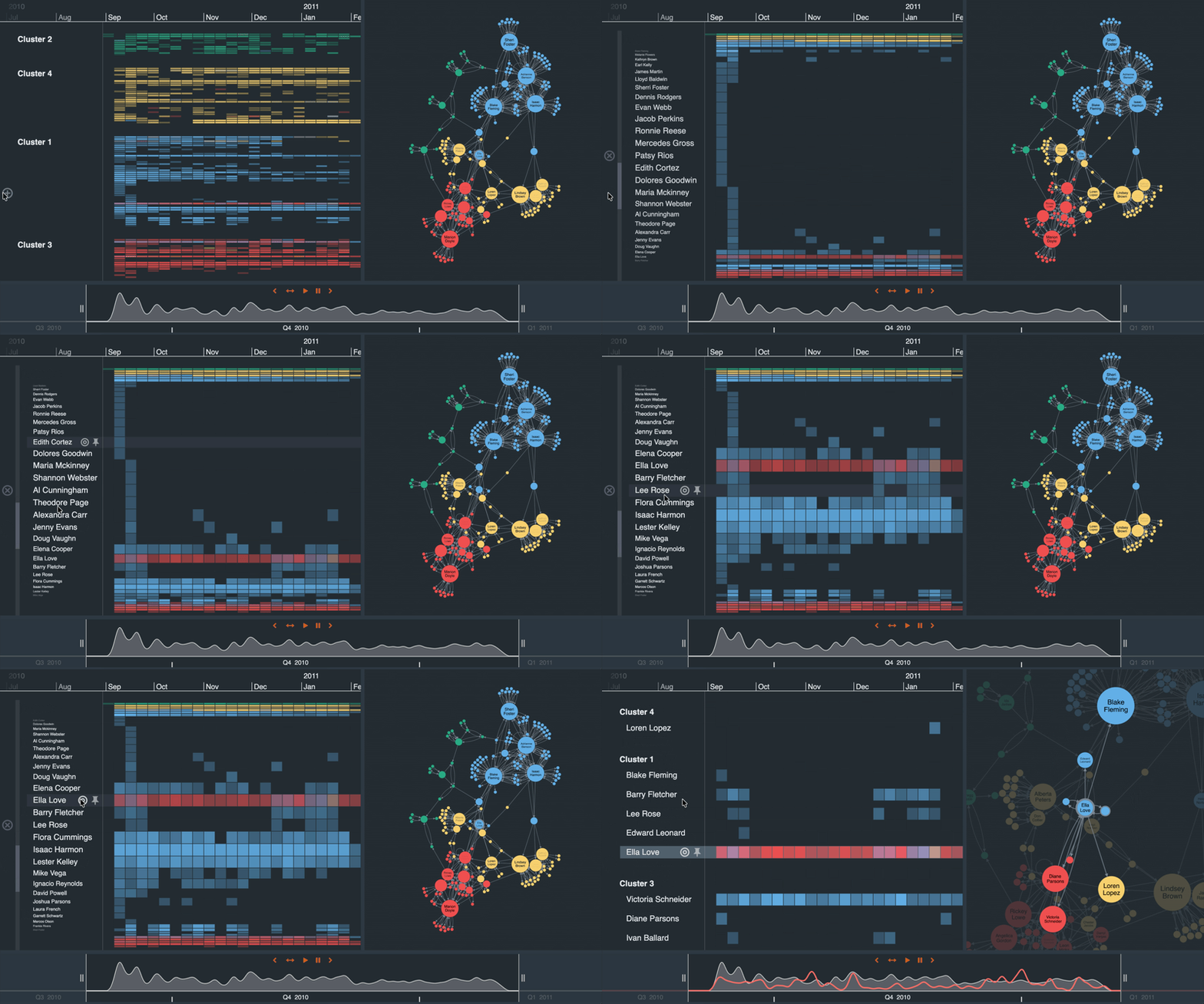
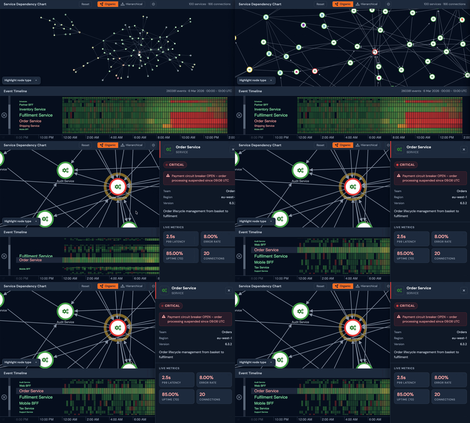
Users can pan across the display to follow activity (events) as it unfolds. If visible data is crowded, KronoGraph aggregates it into a heatmap. This gives users a higher-level summary of busy periods without forcing them to inspect every record. They can zoom back in when they need to return to individual events.
The showcase introduces scale wrapping. Instead of viewing time only as a continuous sequence, users can summarize activity by a repeating unit of time, such as a day or a week. In this example, this makes emails sent at unusual hours easier to spot.
The showcase ends by showing how styling can draw attention to events of interest, giving users a way to highlight significant moments and inspect what happened around them.
What you can evaluate
For product and engineering teams, this showcase demonstrates how KronoGraph can support scalable timeline interfaces inside web applications. It shows how users can navigate dense event data, move between heatmap and individual record views, and use Scale Wrapping to reveal patterns that are difficult to see in a linear timeline.
The showcase demonstrates the value of interactive timeline can support investigations by making event data easier to navigate, summarize and examine at the right level of detail.